UX Project - Spotify Redesign
Personal Portfolio Project
The Problem
This project grew out of my own frustrations with the Spotify desktop app. On a daily basis, I found the experience cluttered with content that wasn't relevant to me, making it harder to get to the music and podcasts I actually wanted. Over time, this became enough of a pain point that I started using Spotify less, missing new releases and putting off playlist updates altogether.
This prompted me to take a closer look at the app and assess the issues I was encountering. My main findings were:
Unnecessary bloat, such as Spotify-generated mixes and radios taking priority over user-preferred content
No easy way to identify new releases from followed artists
No quick access to followed artists from the home page
A home screen that offers little value to the user
A pushy experience that surfaces artists you have no interest in
Artist pages that aren't used to their full potential
A cluttered UI that sometimes duplicates content
The Current Design
To give more context to these findings, I'll walk through a few screenshots of the app in detail, starting with the first image below.
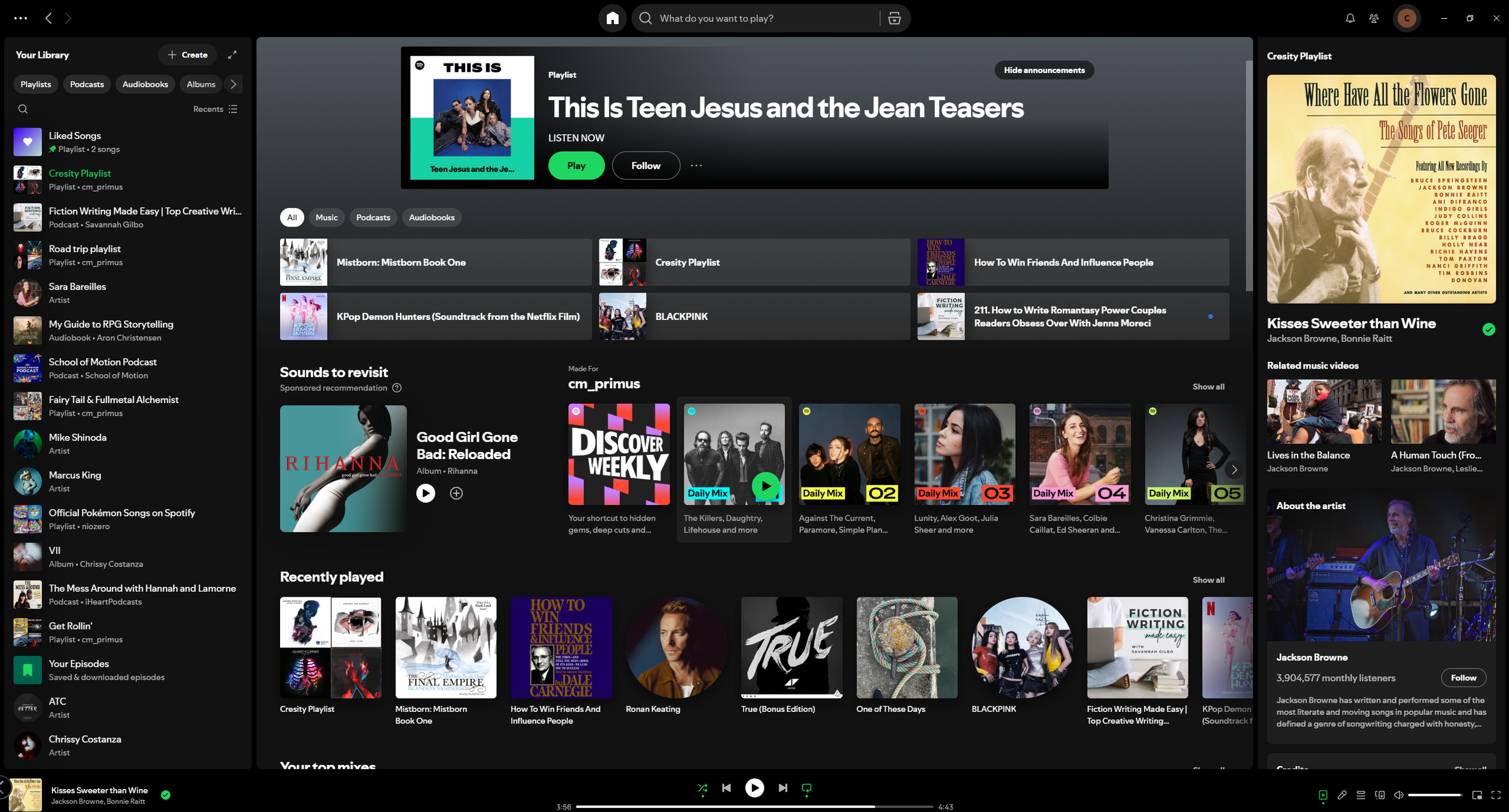
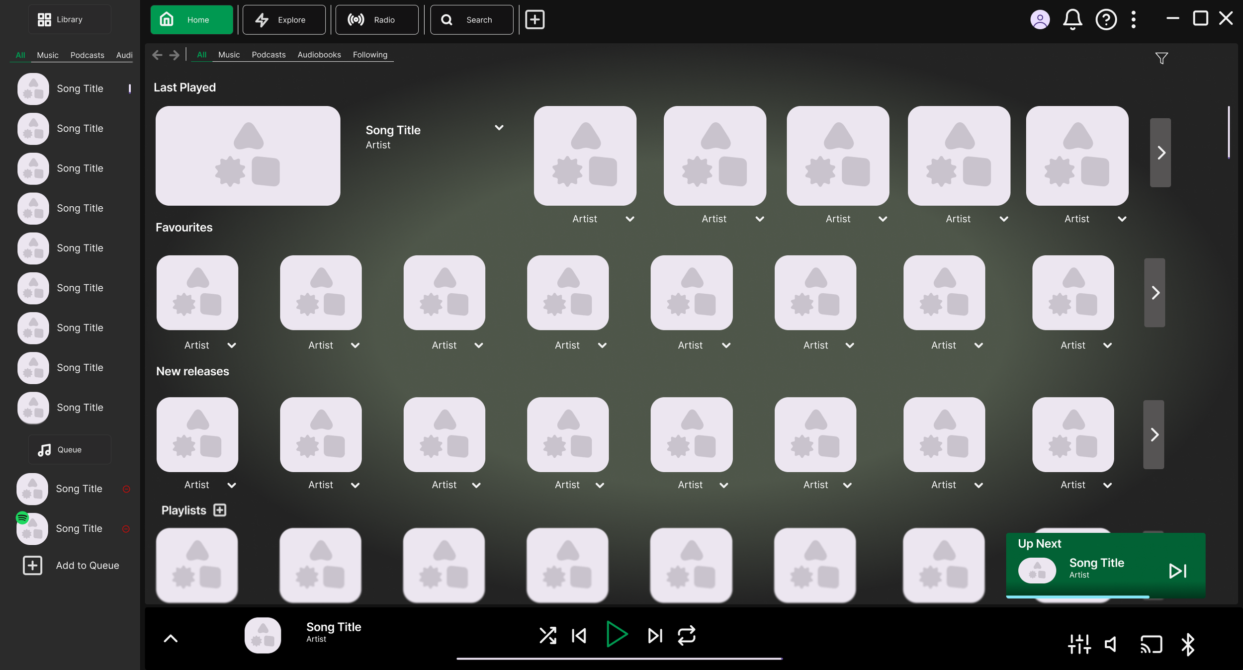
The home screen is immediately overwhelming, with too much competing for the user's attention instead of surfacing the content they actually want. This is a significant pain point, the home screen should feel tailored to the user, not filled with pushed content they never asked for.
A clear example of this is the duplication of the "Recently Played" section, which appears both at the top of the page and again further down as "Last Played." This is wasted space that could be used to show more relevant content instead.
The carousels, such as "Sounds to Revisit" and "Made For You", also add little value. Recommendations aren't inherently unwanted, but they shouldn't come at the cost of making it harder to reach content the user already follows. It currently takes more clicks to find followed artists and playlists than it does to encounter content the user has no interest in, which suggests the app isn't prioritising the user's needs.
Spotify has made some positive UX choices, such as the filtering options, but there's still a lot of room for improvement. Overall, the home screen experience creates unnecessary friction that gets in the way of what users actually came to do.
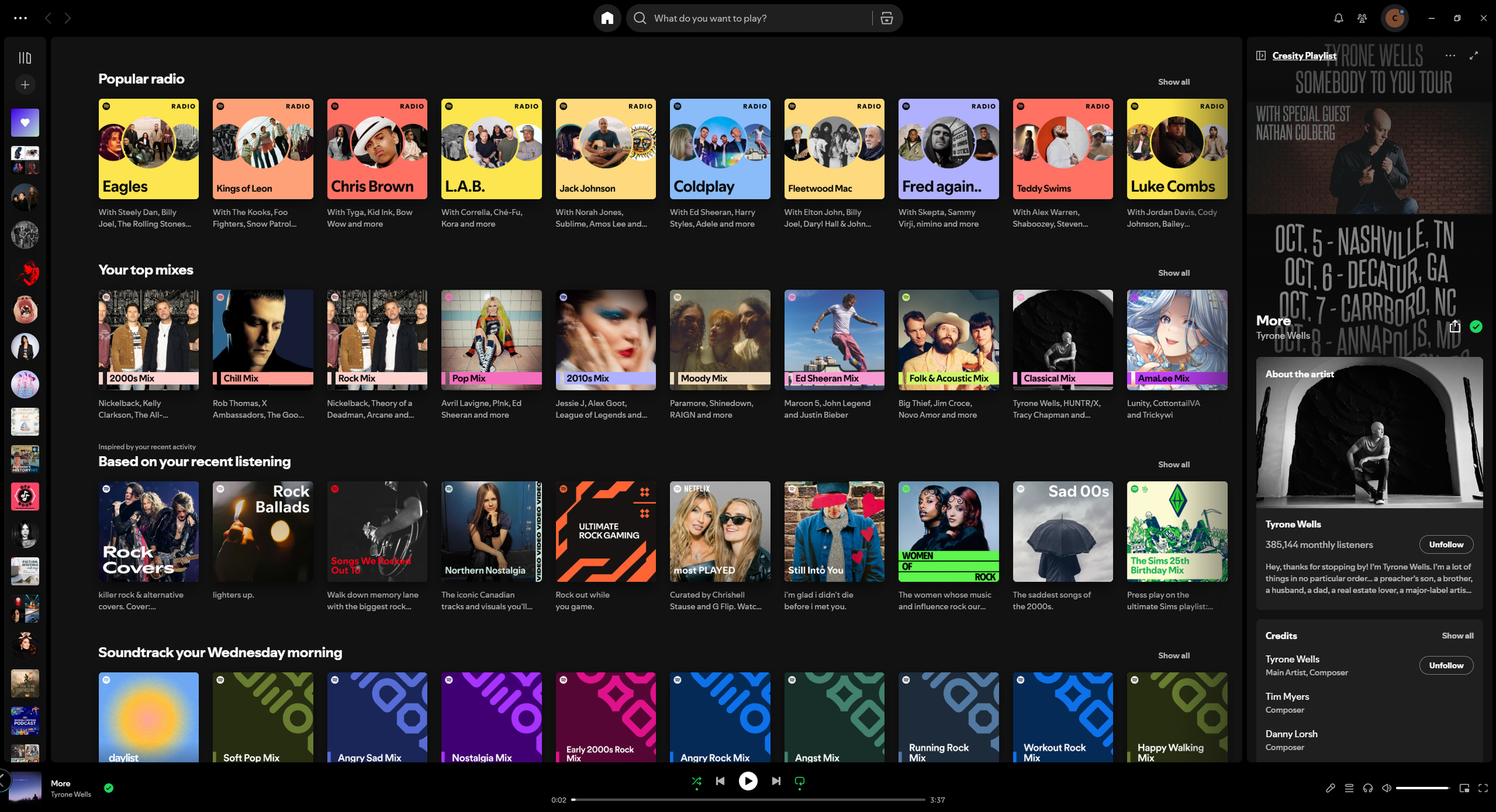
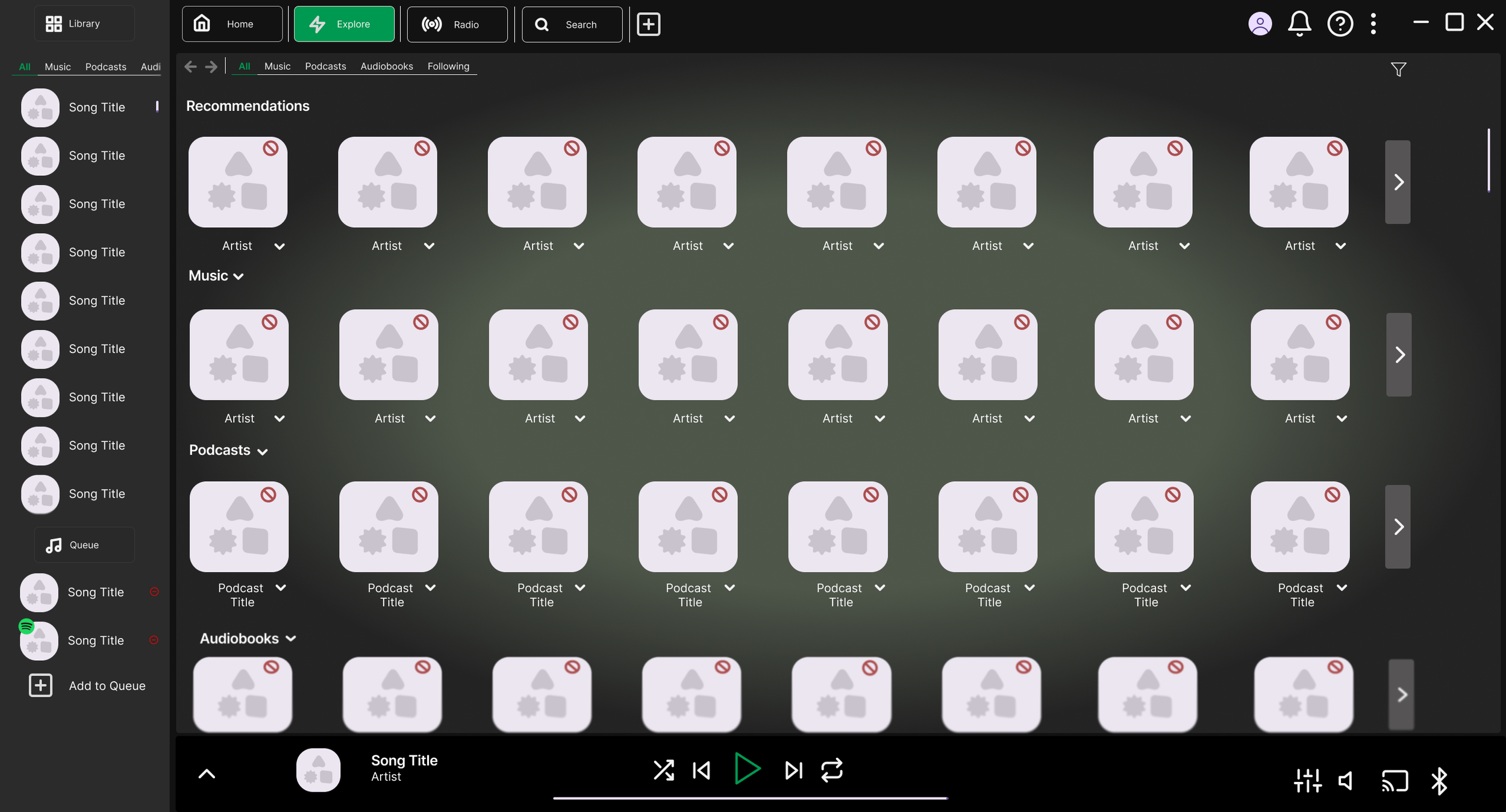
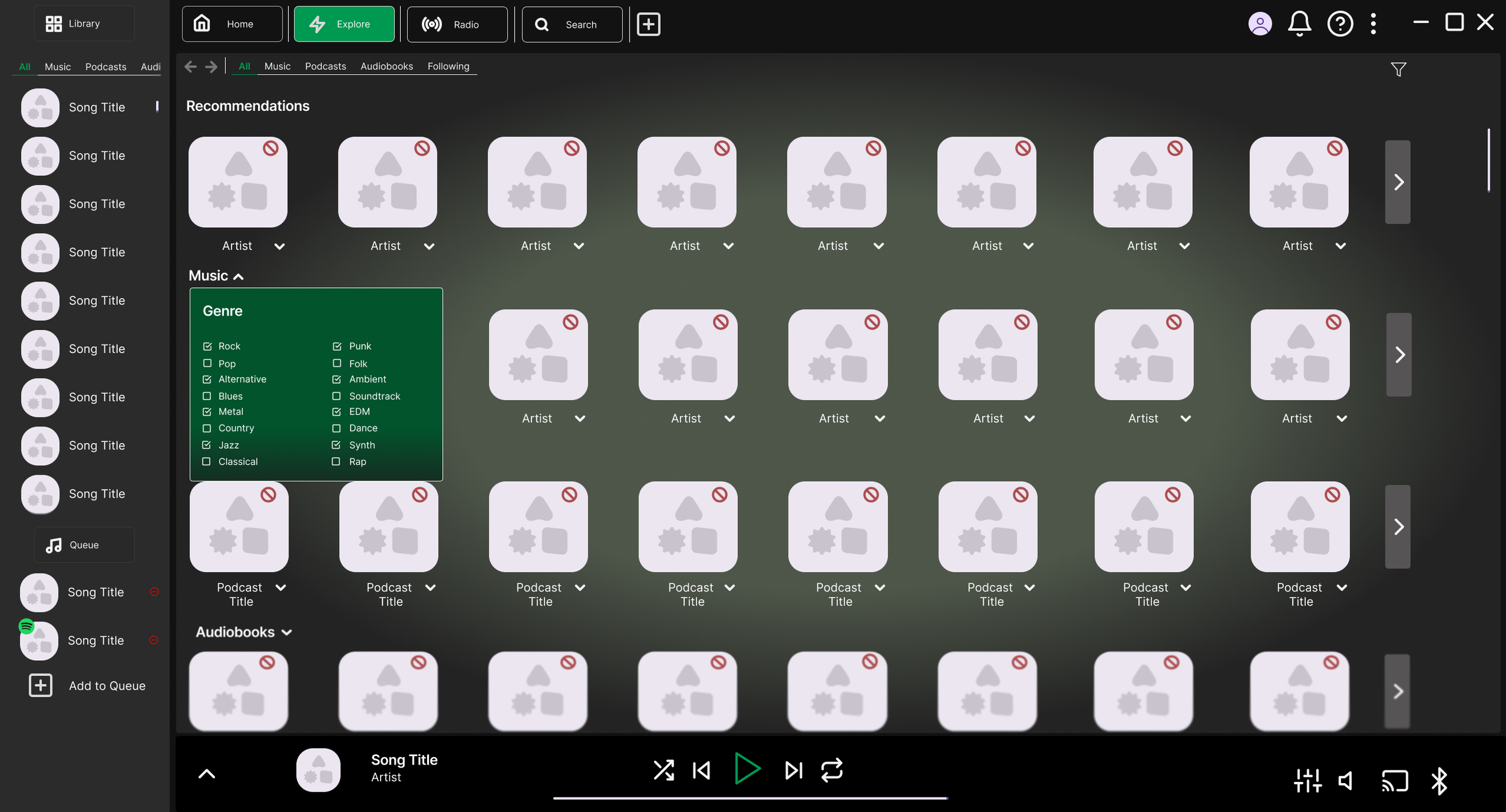
This second image is only slightly further down the home screen, yet user-created content, such as playlists and followed artists, has already disappeared, replaced entirely by recommendations. This feels like a missed opportunity; the space would be far better used displaying followed artists or an expanded library view for users who want more than the sidebar offers.
The dynamically generated categories, such as "Soundtrack your Wednesday Morning," are another issue. While the idea of sparking inspiration is a nice sentiment, these categories are randomly generated based on recent listening and will change each time, meaning there's no guarantee a user will ever see the same suggestion again. This unpredictability makes the feature feel unreliable, and the space would again be better spent on content the user has actively chosen to follow, such as new releases or their own playlists.
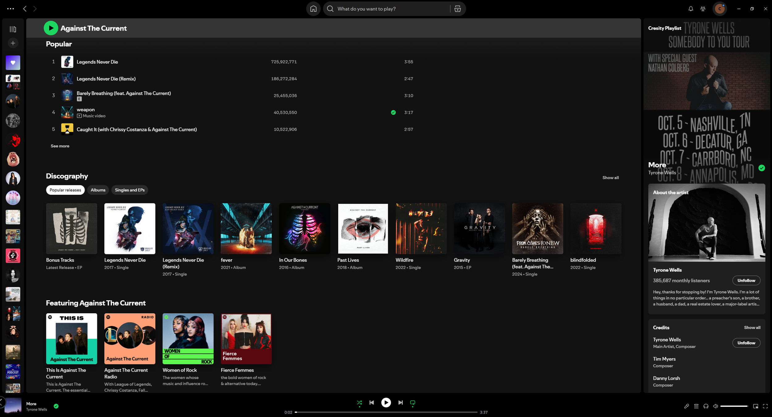
The third image takes a closer look at artist pages.
The way albums are presented here is a key issue. Grouping everything under a single "Discography" section doesn't work well in practice, only a few items are shown at a time, requiring extra effort from the user to find the albums or songs they're looking for. What makes this more frustrating is that the space is there to display more, but Spotify has chosen to fill it with generated mixes and radios instead.
An artist page should make it easy to browse everything an artist has to offer. Better accessibility here would benefit both the listener and the artist, particularly emerging artists trying to get their music discovered. As it stands, it's a pain point for both sides.
These are my personal observations, but a proper analysis requires broader research into how other users experience the desktop app. This will help inform the next steps and shape the improvements I look to make.
Research & Case Studies
The People
To start my research, I looked into what other users disliked about the Spotify app, combining desk research with direct conversations to find points that either aligned with my own frustrations or highlighted new ones. It quickly became clear that these issues were widely shared and find a case study for this type of user.
The main themes I identified, and felt were worth exploring further, are listed below.

“Sometimes it feels like Spotify doesn’t understand the difference between ‘content I like’ and ‘content I tapped once.’ I listened to an audiobook sample and suddenly audiobooks took over my recommendations. There’s no way to say, ‘No, I don’t want this.’”
“I don’t understand the logic of the Library. I have playlists and albums and liked songs, but each section behaves differently, and I never know what I’m going to see. It feels like the system was designed by different teams who never talked to each other.”
“The home screen is chaos. There’s like fifty carousels and only the top two seem relevant. After that, it’s random podcasts I don’t care about or artists I’ve never listened to.”
“If I listen to one podcast episode, Spotify assumes I want to binge podcasts forever. I keep getting podcast recommendations clogging up the home page for months. It’s almost like a punishment.”
“A random slow song started playing in the middle of the party because Spotify thought it was a good recommendation. Not ideal.”
“Honestly, everything just feels kind of cluttered. I open the app and it’s this wall of recommendations that I mostly ignore. The stuff I actually want, like the playlists I made , is two or three clicks deep. I don’t understand why the app hides what I intentionally created and pushes a ton of stuff I didn’t.”
“I was trying to queue up songs for a party, and the queue interface was so awkward. I kept losing track of what was actually playing next because the queue mixes 'recommended songs' into the list without being obvious about it.”
“Since they added audiobooks, everything is mixed together, music, podcasts, audiobooks. The categories don’t feel clean. It’s like they bolted features on top of each other.”
After gathering responses from users, several clear and consistent themes emerged that highlighted the core pain points with the current Spotify desktop experience.
1. The algorithm mistakes activity for preference
Users consistently felt that Spotify over-indexes on single interactions, treating an accidental tap or one-off listen as a lasting interest. With no way to dismiss or correct this, unwanted content types began dominating recommendations for extended periods. Users felt unheard and frustrated by the lack of control.
2. The Library lacks consistency and logic
Multiple users described the Library as unpredictable, with playlists, albums, and liked songs each behaving differently. The overall impression was of a system that had grown without a unified design vision, making it difficult for users to build a reliable mental model of where things are.
3. The home screen prioritises Spotify over the user
The home screen was widely described as cluttered and overwhelming. Users noted that only the first couple of carousels felt relevant, with everything below feeling like noise. Most critically, intentionally created content, such as playlists and followed artists, was buried two or three clicks deep, while unsolicited recommendations were front and centre.
4. The queue experience breaks trust
Users attempting to control their listening found the queue unreliable. Spotify's habit of silently inserting recommended songs into the queue without clear signposting led to unexpected and sometimes disruptive playback, undermining the user's sense of control.
Across all responses, the central issue was the same, Spotify consistently prioritises its own content agenda over the user's established preferences. Users don't want to feel disconnected with not being able to find what they are after. The redesign should focus on restoring user control, simplifying the home screen, and creating a Library experience that is consistent and built around what the user has intentionally chosen.
Other Apps
To broaden my perspective, I looked at the Steam app and Netflix website as reference points, noting the positives and negatives of their designs. Both are generally well-regarded by users for things like clear categorisation and easy navigation, which gave me useful benchmarks to draw from.
Steam
Steam's library is clearly structured and easy to navigate, with reliable filtering and sorting that makes finding games straightforward. Players have good control over their own library, with the ability to categorise and tag games, and there's a clear separation between the store and the library. On the downside, the UI is inconsistent in places, some areas feel like they haven't been updated in years, and the download manager lacks clarity. Certain pages, particularly in the store, can also be slow to load.
Netflix
Netflix's layout is clean and visual, with thumbnail rows that are easy to scan. The homepage feels personalised to the user's viewing habits, the "Continue Watching" row is easy to find, and getting into content requires very few steps. However, inconsistent categorisation means similar titles often appear across multiple rows without much logic. The recommendation algorithm can feel repetitive over time, and users have very little ability to hide or dismiss content they're not interested in, adding to a sense of clutter and decision fatigue.
Looking at both platforms provided a useful reference point, highlighting strengths to draw from and weaknesses to avoid when shaping my own design.
Results
Using all the research gathered, I put together a design brief to guide the new concept. The key goals are:
Create a clean, stable library structure (e.g. Music / Podcasts / Audiobooks) to simplify navigation
Reduce navigation depth so users can reach saved playlists in one click
Add a "Not Interested" or "Hide this content type" option on cards
Allow users to filter between Music, Podcasts, and Audiobooks via persistent toggles
Create a clear visual distinction between user-queued songs and Spotify-added songs
Ensure "Next Up" accurately reflects what will play, without unexpected changes
Move recommendations to a separate area to declutter the home page
Make playlist creation quicker and easier to access
Set clear boundaries so recommendations don't dominate entire pages
Explore a new feature that could re-engage users and draw them back to the app
This brief gives me a solid foundation to stay focused on the core issues and design toward what users actually want.
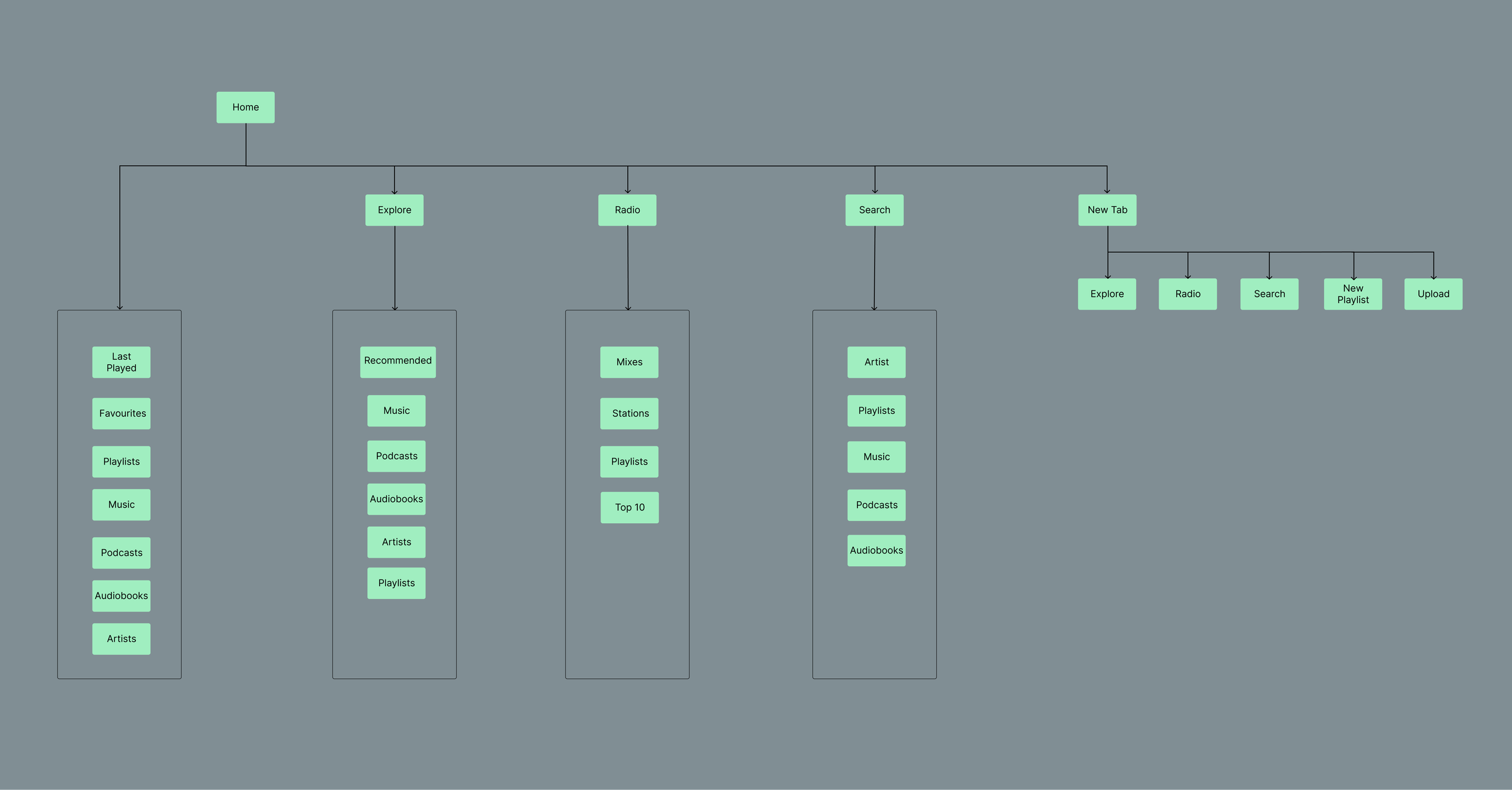
With the design brief in place, I put together a simple user flow to map out where the key features would sit in the new design.
The structure was shaped by the themes that kept surfacing across both personal experience and outside research. The starting point is the home screen, from the moment the user opens the app, they're met with content tailored to them. No recommendations, no clutter. Just easy access to things like new releases and followed artists.
Beyond the home screen, the app is broken into three sections:
Explore: The dedicated space for recommendations. By separating discovery from the home screen, users who want to find new music or podcasts can choose to do so, rather than having it pushed on them.
Radio: A home for Spotify's existing mixes and radio stations, ensuring users who rely on these features still have easy access. This section also opens the door to broader integration, such as local radio stations.
Tabs: A new addition to improve navigation. This allows users to keep multiple pages open simultaneously, such as a playlist and an artist page, giving them more control over how they move through the app.
Together, these changes aim to put the user back in control and reduce the friction of finding what they actually came for.
With everything in place, I have a solid foundation to begin wireframing the new design concept.
The New Design
With the brief as a guide, I've put together mid-to-high fidelity wireframes exploring a new direction for the Spotify app, aimed at creating a more user-friendly experience than the current design.
Loading Screen
The first design addresses the app's loading and update screen. Taking inspiration from Steam's loading pop-up, I created a Spotify version that keeps the user informed about what the app is doing on start-up, including update progress. This gives clearer feedback in moments where the app might take longer than expected.
I'll acknowledge that most modern PCs will load quickly enough to bypass this screen entirely, but it's a useful safeguard for slower situations and a more intuitive way to communicate what's happening in the background.
The design itself is intentionally simple, a large Spotify wordmark with a gradient background that stays true to the brand's colour palette. Since this is a screen most users will move past quickly, keeping it clean and on-brand felt like the right call.

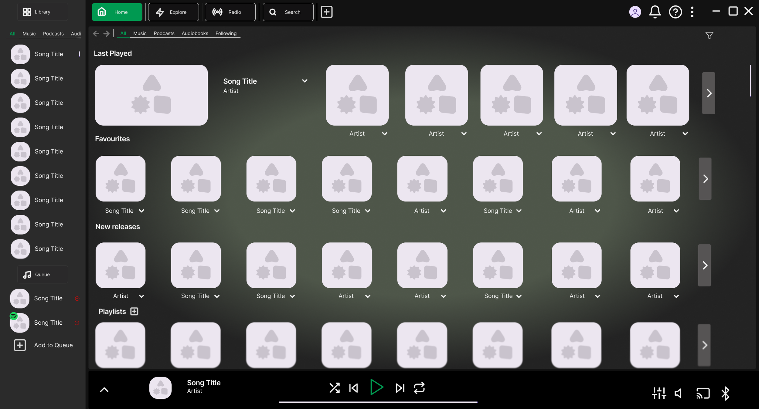
Main Home Screen
The home screen has been significantly redesigned to strip back the clutter and create a cleaner, more streamlined experience. The new layout is organised into four distinct sections: the Main Menu Bar, the Library, the Main Screen, and the Mini Player, each of which I'll walk through in detail below.
Main Menu Bar
The menu has been redesigned with five options, Home, Explore, Radio, Search, and New Tab, presented in a tab-style layout. This format will feel familiar to most users, mirroring the tab systems found in web browsers. Each tab is clearly sized and labelled, with the active tab highlighted in Spotify's brand colours for easy orientation. A plus icon signals that new tabs can be created, giving users instant visual feedback.
The New Tab option was added specifically to make playlist creation easier, users can have a search tab open alongside a playlist tab, switching between the two with a single click.
To the right of the menu sits the account, notifications, help, and a dropdown menu. This area didn't need major changes, but I pulled the help button out into its own dedicated spot for quicker access when users need it.
Library
The Library retains a similar structure to the current version, as the sidebar approach works well, allowing users to browse their content while navigating the rest of the app without extra clicks. Content filtering has also been kept, as it was already a strong design decision.
The main addition here is a queue section. Though compact, it gives users a quick view of the next two or three songs coming up, with the ability to remove tracks directly from the queue. To address one of the key brief points, any Spotify-generated songs in the queue are marked with a small Spotify icon overlaid on the album cover, making it immediately clear which tracks the user added and which ones Spotify inserted.
Main Screen
The main window is entirely user-focused, no recommendations, no pushed content. A gradient background in Spotify's brand colours draws the eye and gives the space a polished feel.
The first section is Last Played, with the most recent item displayed larger than the rest to encourage users to pick up where they left off. Each tile shows the relevant thumbnail, and a dropdown reveals more details or a track listing without cluttering the main view.
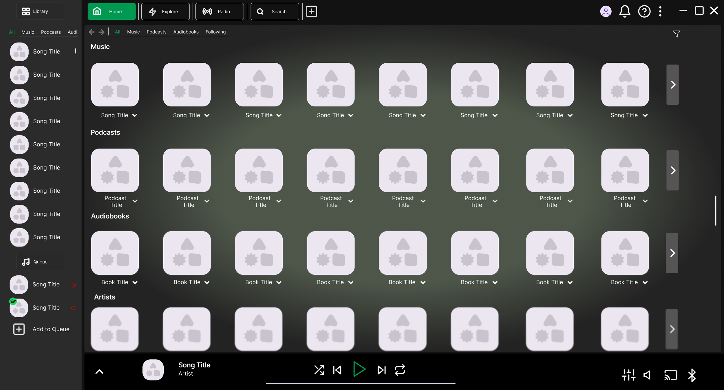
Below that is a Favourites section for quick access to anything the user has saved. Following this, the screen is divided into clearly labelled sections for Playlists, Music, Audiobooks, Artists, and Podcasts, each kept clean and easy to scan. These sections can be reordered by the user based on preference.
At the top of the main window, basic content filters allow users to narrow the view quickly, while an advanced filtering option on the right caters to those who want more control.
Mini Player — Collapsed
The collapsed mini player is largely similar to the current version, with a few key changes. The playback icons have been given a subtle style refresh while staying on-brand, and the player has been shortened so it no longer covers the Library and queue section, keeping everything accessible at once and maintaining the app's clean, sectioned layout.
On the right side, the lyrics and queue buttons have been removed. The queue has been moved into the Library panel, and lyrics have been replaced with connectivity icons, such as device sharing, which better reflects how users actually interact with this area.
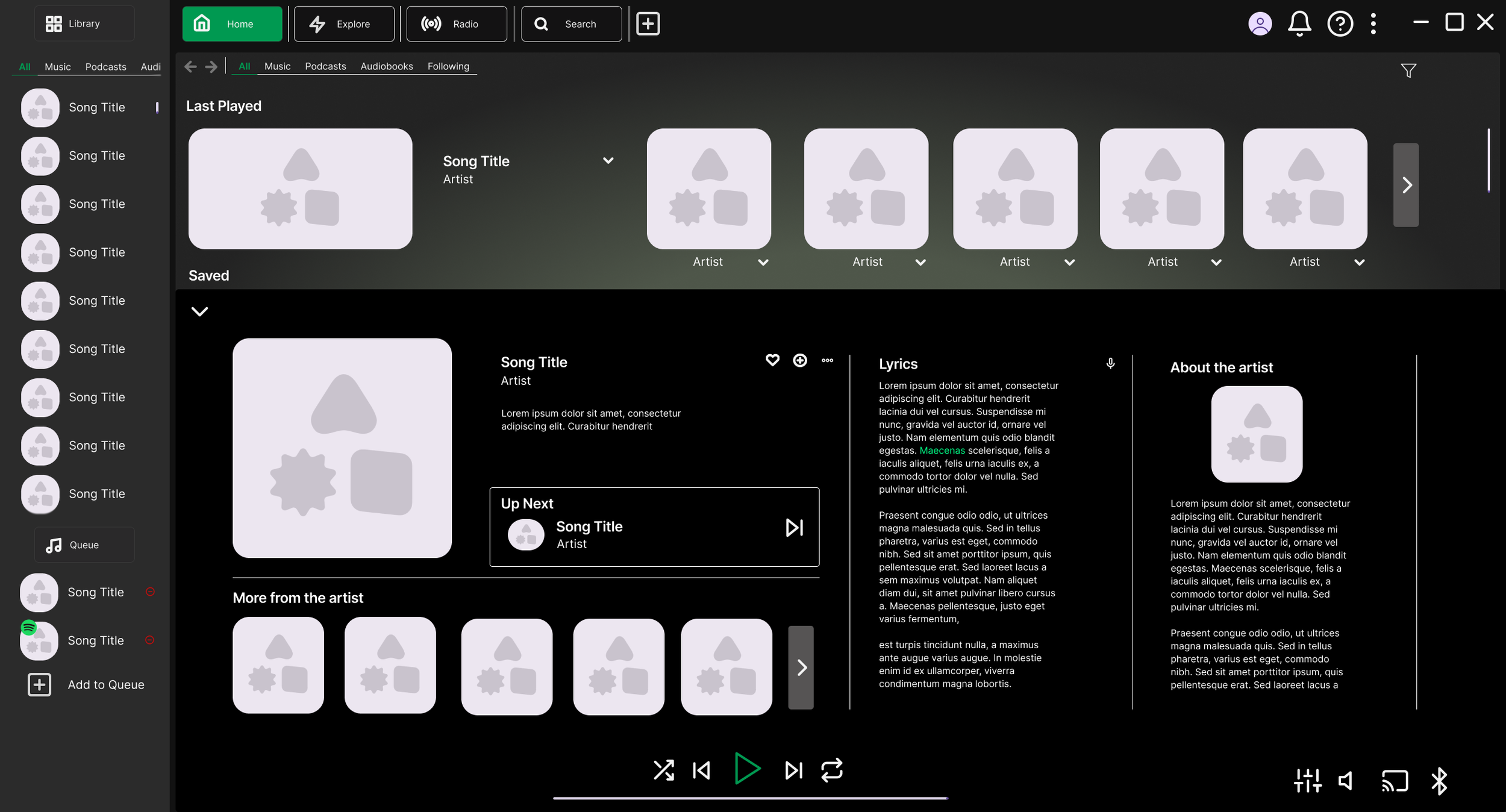
Mini Player — Expanded
The expanded view makes better use of the available space compared to Spotify's current side panel. The focal point is the currently playing track, displayed as the largest element in the section. From here, users can quickly add the song to a playlist or mark it as a favourite.
If the queue isn't in use, the expanded player also shows what's coming up next, following the same Spotify icon indicator system to distinguish between user-added and Spotify-generated tracks.
The rest of the expanded view organises information into clear sections: interactive elements like lyrics and related songs are grouped together, while artist information sits separately as readable context. This separation makes it easy for users to understand what each part of the panel is for.
The background colour carries over from the collapsed state to maintain visual continuity, with a subtle radial gradient around the playing track to draw the user's focus. Core controls, playback and volume, remain fixed in place throughout, ensuring the user always knows where to find them.
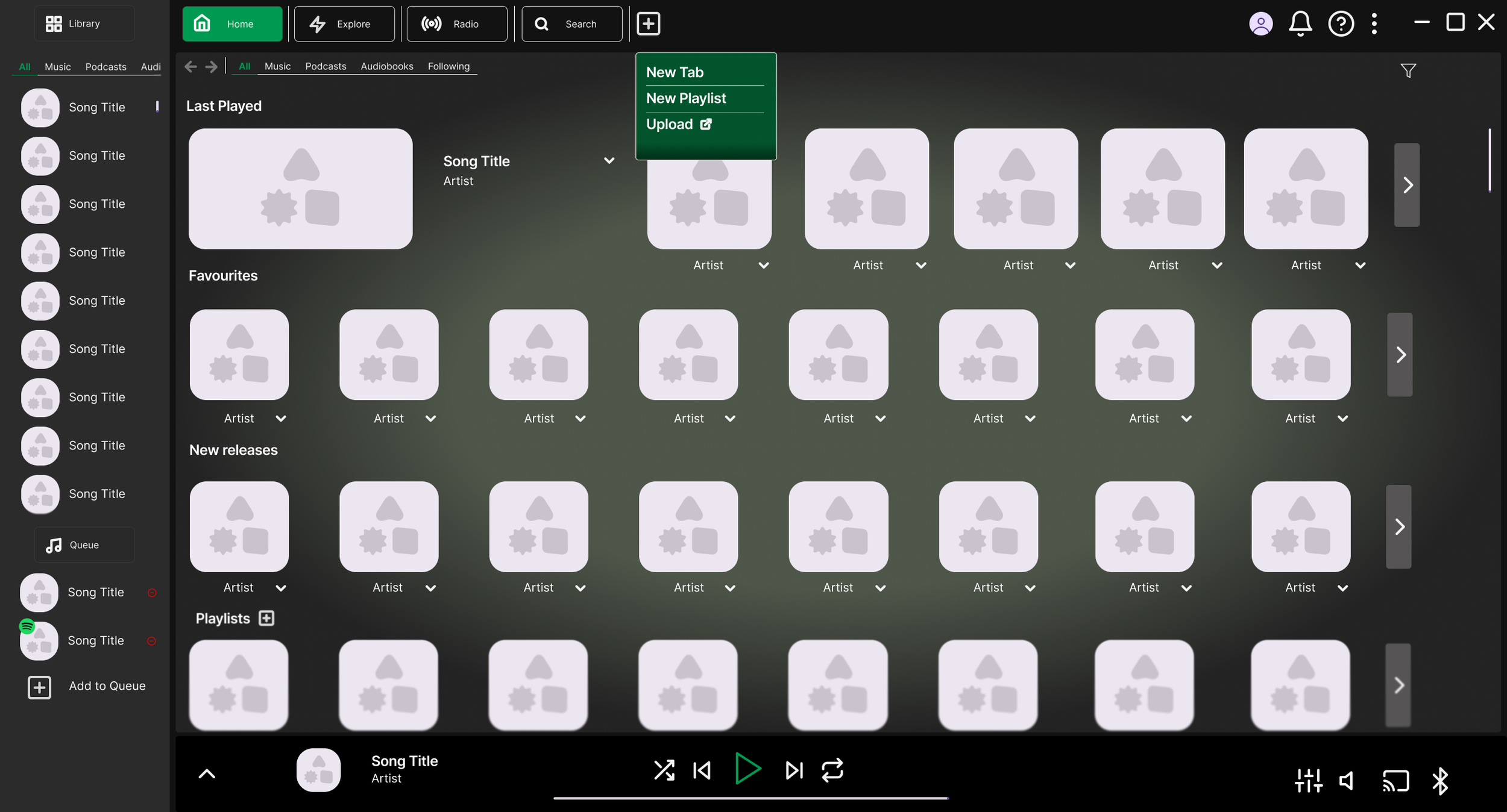
These final home screen concepts focus on quality of life improvements.
The first shows what appears when hovering over the plus icon in the menu bar, a small dropdown offering three options: opening a new tab, quickly creating a new playlist in a new tab, or uploading personal content such as music or podcasts, which redirects the user to Spotify's upload instructions. The design uses brand colours and enough contrast to stand out from the background and catch the user's attention.
The second is a small timed pop-up that notifies the user of the next song coming up. It takes inspiration from Netflix's "next episode" prompt, a lightweight way to keep the user informed without requiring them to navigate anywhere. The same brand colours are used here to keep it visually consistent and easy to notice.
Explore
The Explore page is where all recommendations now live, creating a clear separation between suggested content and the user's own library. Since only the main window changes when switching tabs, the Library and Mini Player remain accessible at all times.
The page follows the same visual style as the rest of the app, consistent tile designs, filtering options, and clear headings for each content type, keeping the experience familiar. A general recommendations carousel sits at the top for quick browsing, with more specific categories below for users looking for something particular.
A key addition here is a dismiss button on each tile, functioning as a "not interested" option. This gives users more control over what they see, making the Explore page more useful over time as the algorithm learns their preferences.
To make the Explore page as useful as possible, each section includes advanced filtering tailored to its content type. Accessed through a dropdown styled to match the rest of the app, these filters give users greater control over what they see, making it easier to find content they'll actually want to listen to.
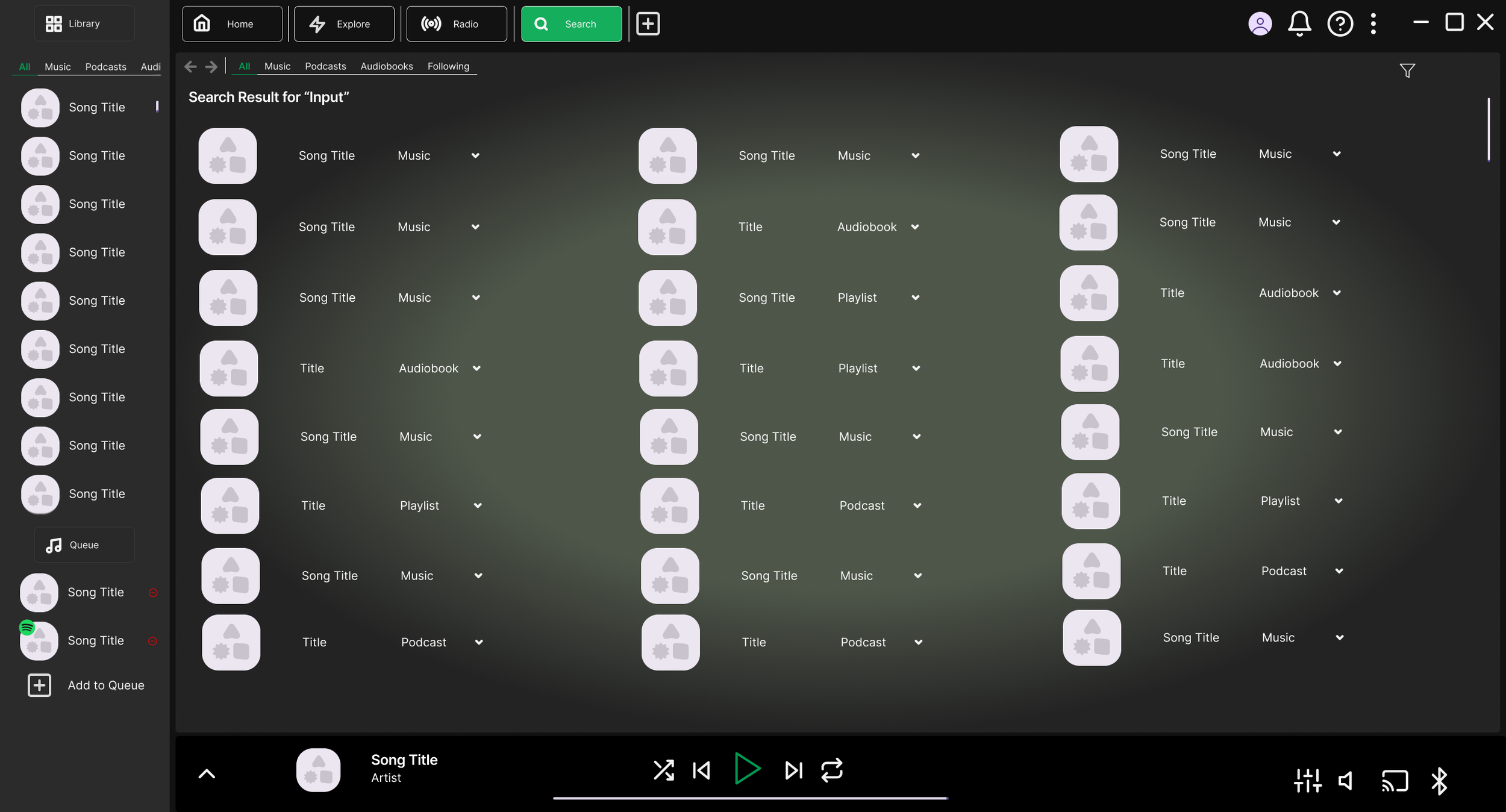
Search
The search bar functions as most users would expect, predictive suggestions appear in a dropdown as the user types, styled consistently with the rest of the app. If the suggestions don't match what they're looking for, users can press enter or click the browse button in the dropdown to go to the full search page. The familiar design should make it immediately intuitive to use.
The full search results page displays results across three columns, allowing users to take in a wide range of results without excessive scrolling. Each result shows the title, content type, and a dropdown button for quick details before clicking through. Filtering options remain available throughout, giving users control over what they see. The overall goal here is clarity, making it easy to scan and find the right result quickly.
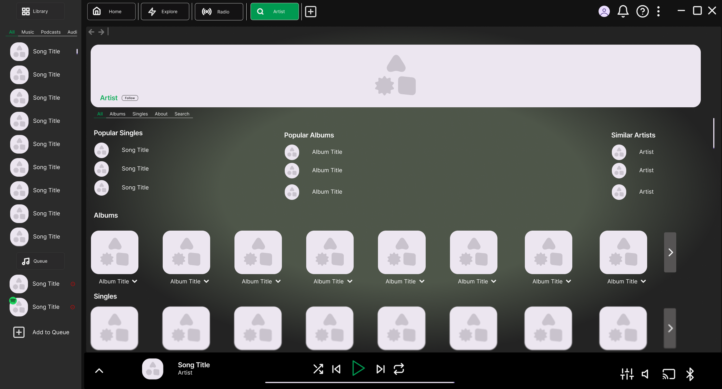
Artists
The artist page is one of the most frequently visited areas of the app, so it warranted careful attention. The main issue with the current design is that everything sits under a single Discography tab, often resulting in duplicate content and making it hard to find what you're looking for.
To fix this, albums and singles have been given their own separate sections, giving each more space and eliminating the duplicate content problem. Features and mixes have been removed from this page entirely, they shouldn't be taking up space that belongs to the artist's own work.
The filtering system returns here with one new addition: a search bar, allowing users to find a specific song by the artist without having to scroll through everything. Popular titles are still surfaced at the top of the page, now split into singles and albums for clearer browsing.
Together, these changes make the artist page significantly easier to navigate and far less cluttered than before.
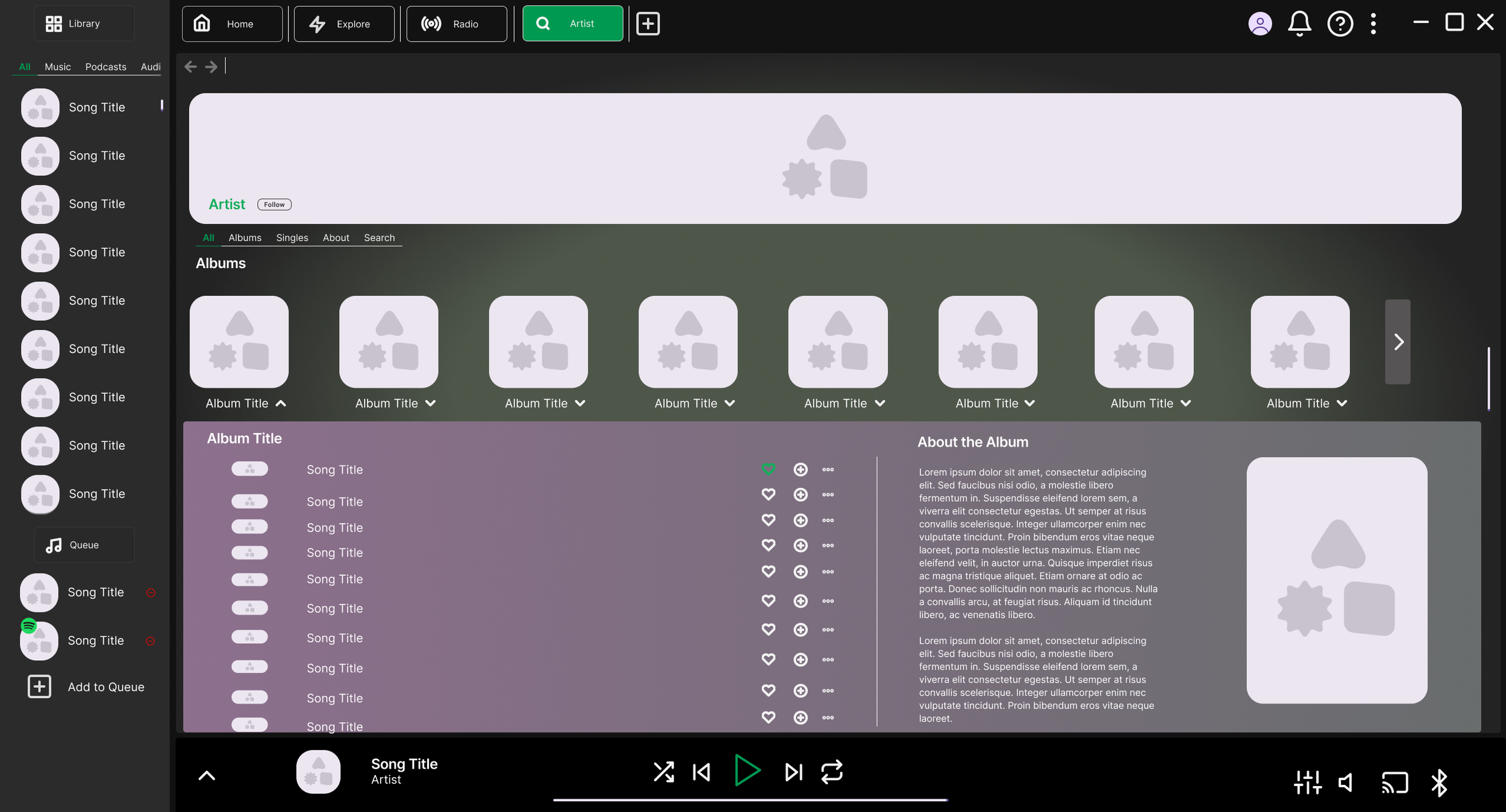
Rather than navigating to a separate page, album and song details now open in a dropdown directly on the artist page. This removes the need for a full page load and makes it easy to move between albums without losing your place.
Each dropdown takes its colour from the album artwork, making it easy to identify which album you're looking at at a glance. The dropdown is split into two sections ,Songs and About.
The Songs section lists the relevant tracks and includes quick action buttons to add to favourites, add to a playlist, or access more options, giving users fast control without extra navigation.
The About section follows a similar layout to the expanded Mini Player, offering more detail about the album along with any links the artist has provided. While not essential, it gives curious users a way to learn more about the album and the artist, which could help emerging artists build a stronger following..
Extra Features
As a final addition, I've designed a Karaoke Mode as a new feature, or at the very least, a reimagining of the existing lyrics functionality. Activated via an icon in the expanded Mini Player, it would mute the vocal track of the currently playing song, turning it into an instant karaoke experience without needing to switch apps or hunt for instrumental mixes. It's a fun, lightweight addition that adds extra value for users who enjoy karaoke and makes the app a little more versatile in social settings.
That wraps up my design concepts. While I haven't had the opportunity to formally user test these, I gathered constructive feedback from peers throughout the process, which helped shape and refine the final designs. It was a valuable exercise in exploring new ideas while staying true to Spotify's brand identity.
I hope this gives a clear sense of my design thinking and process. If you have any questions, feel free to reach out.