
UX Project - Heroku Dyno Options
Personal UX Research and Design Portfolio Project
Summary
The problem: Heroku’s plans are confusing and unoptimized to allow users to fully understand the proper flow, while reducing the bill anxiety in the unclear jump in price and scaling.
My role: Personal UX research and design project, featuring problem discovery, user research, wireframing, and UI/UX design.
Tools & methods: Figma, desk research & heuristic evaluation.
What changed in the design:
Streamlined the options into more clear markers for the customer rather than a dropdown menu.
Made the information changeable depending on the level of tech knowledge, making three categories of Personal, Start-up & Enterprise.
Provided an option to make a budget cap and warning so the user can be aware of any potential jumps in price.
Showcased recommendations to the user of what would suit their best options.
Created a way for users to calculate what multiple options would look like per month.
Created a new cart slide out panel, allowing the user to view the details and additional features.
The Problem & Research
Doing a deep dive into desk research, The cloud platform as a service site Heroku has known to be less user friendly to it’s users, especially when it comes to billing it’s users when they go over their monthly plan as projects can grow bigger in scale which in terms of hosting means that there is a major price hike, often referred to in developer circles as the “Heroku Tax shock”.
When looking into the pain points of users purchasing there was often confusion about the choice of what to go for as a lot of information is not exactly clear and the options they provide are not in the usual spectrum of terms used. In addition to the fact that each tier and size has it’s own benefits that are not showcased properly.
It is why users have tried to move to other providers like fly.io as an alternative option as they don’t have the price hikes that Heroku is known for, as well as less bloated content to easily compare the different options.
This has lead me to pin on these three points:
The "Heroku Tax" Shock: Users frequently complain on Hacker News and Reddit that moving from a basic hobby project to production-ready computing is a massive, confusing price jump.
The Dyno Math Paradox: Heroku bills based on "Dyno hours" and usage, meaning developers cannot easily estimate exactly what their monthly bill will be before putting down a credit card.
Analysis Paralysis: The feature matrix comparing "Eco," "Basic," "Production," and "Advanced" tiers contains dense, overly technical infrastructure jargon that business decision-makers find difficult to quickly evaluate.
The goal of this project is to redesign the way users would view this information and add a way to calculate how much things will cost in the long run while keeping to a budget cap. Along with a different cart experience to keep the users away from any purchase anxieties. So to begin with I will move to doing some evaluations of the current site and other sites for inspiration on next steps.
Heuristic Evaluation of Current Site
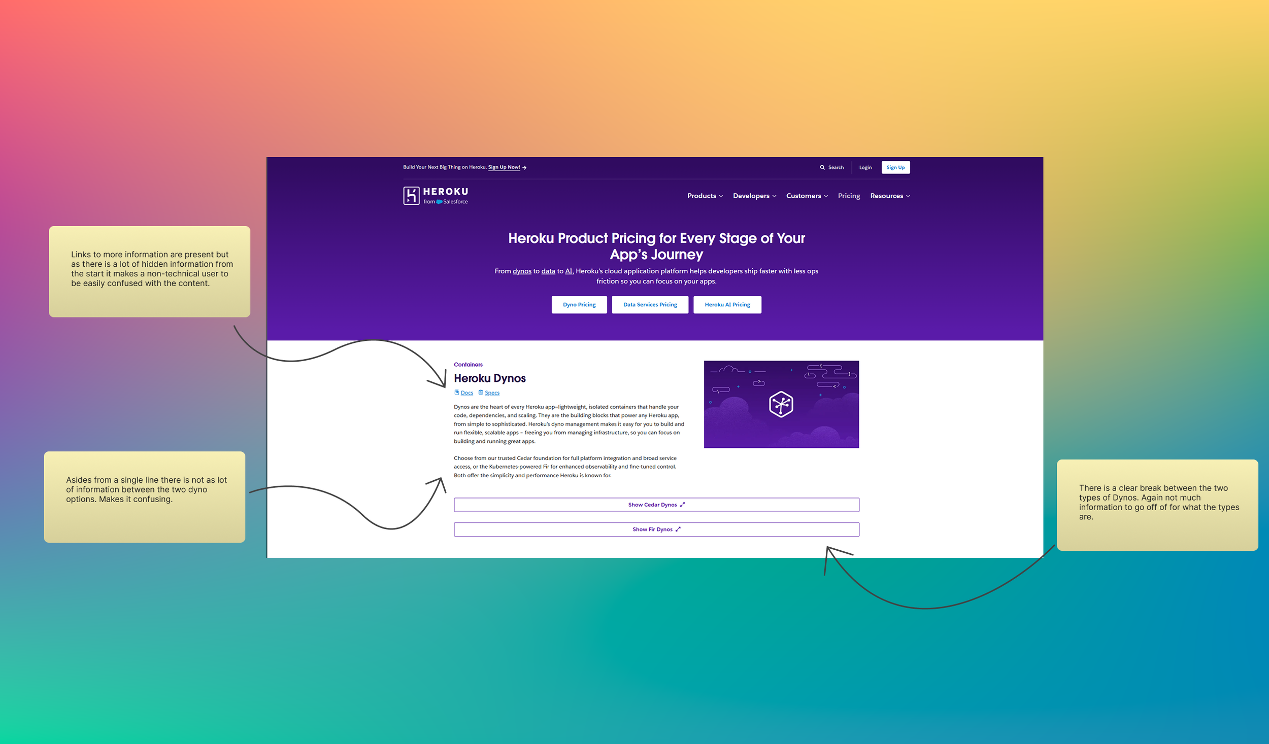
In order to find if the pain points people were having I looked into their pricing page and did a heuristic evaluation on what works and what doesn’t. Which coming into this with less technical knowledge on the hosting and cloud services Heroku provides I believe will make me think of a wider range to bring into this. I began to see that there was choices the user could make but there wasn’t that much in formation about the differences of versions, especially from the Cedar and Fir dynos, offering only one line of text each, which for someone who might be new to hosting can be less than helpful to not have this information on the same page. Even if there are links to other documents it still needs more in the page to give some more context.
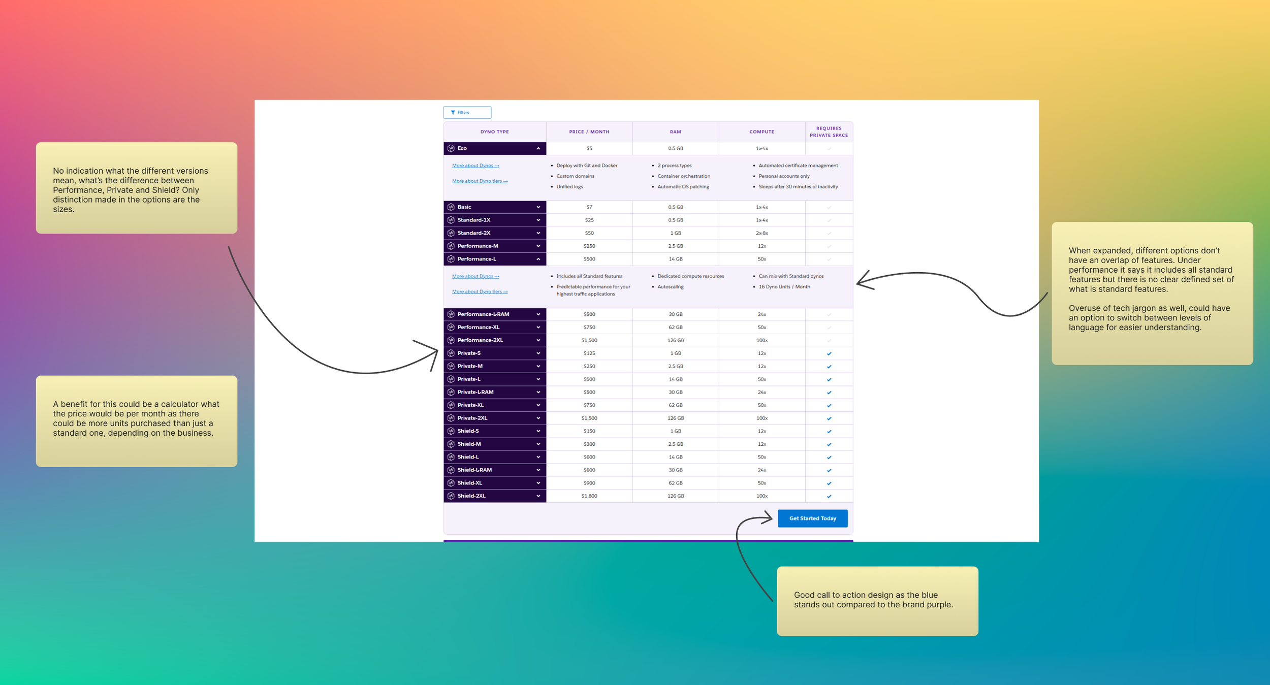
In terms of viewing the pricing in the second slide, asides from the different sizes there is no indication of what the standard difference is between the versions of eco, basic, standard etc. This makes it hard for the user to decide on what to chose as while it does have information, it is still limiting as to what the packages actually offer to the user. Once again the overuse of tech jargon makes it so anyone new to this area who needs more information can’t make a proper decision, a simple fix of adding an information button so users can lessen the anxiety of picking the wrong option.
Below are my quick notes on the current site and perspective on what is and isn’t working.
Heuristic Evaluation of Similar Websites
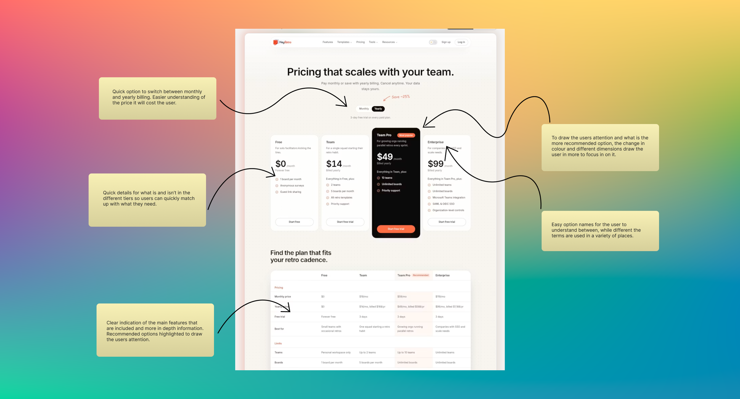
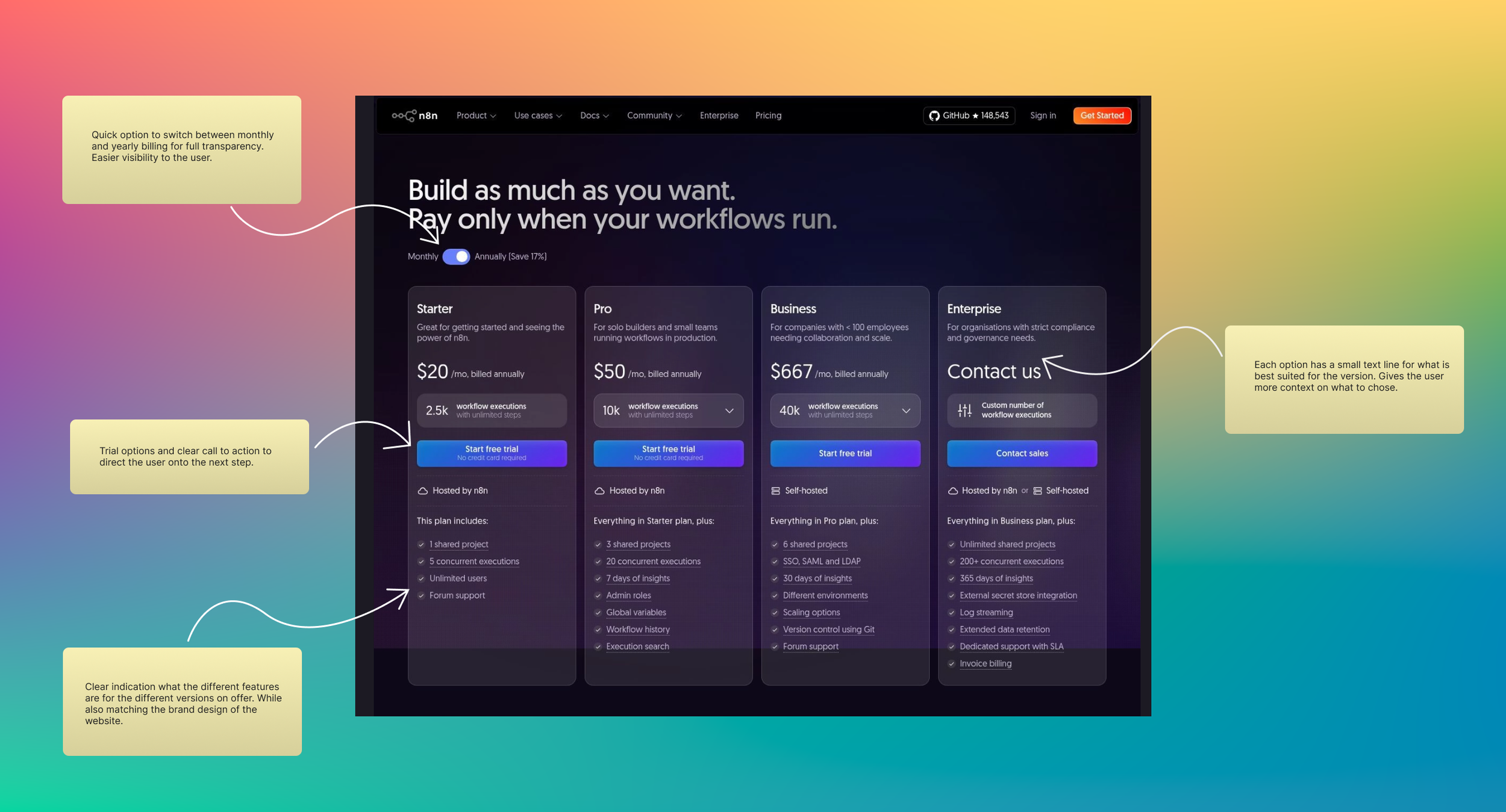
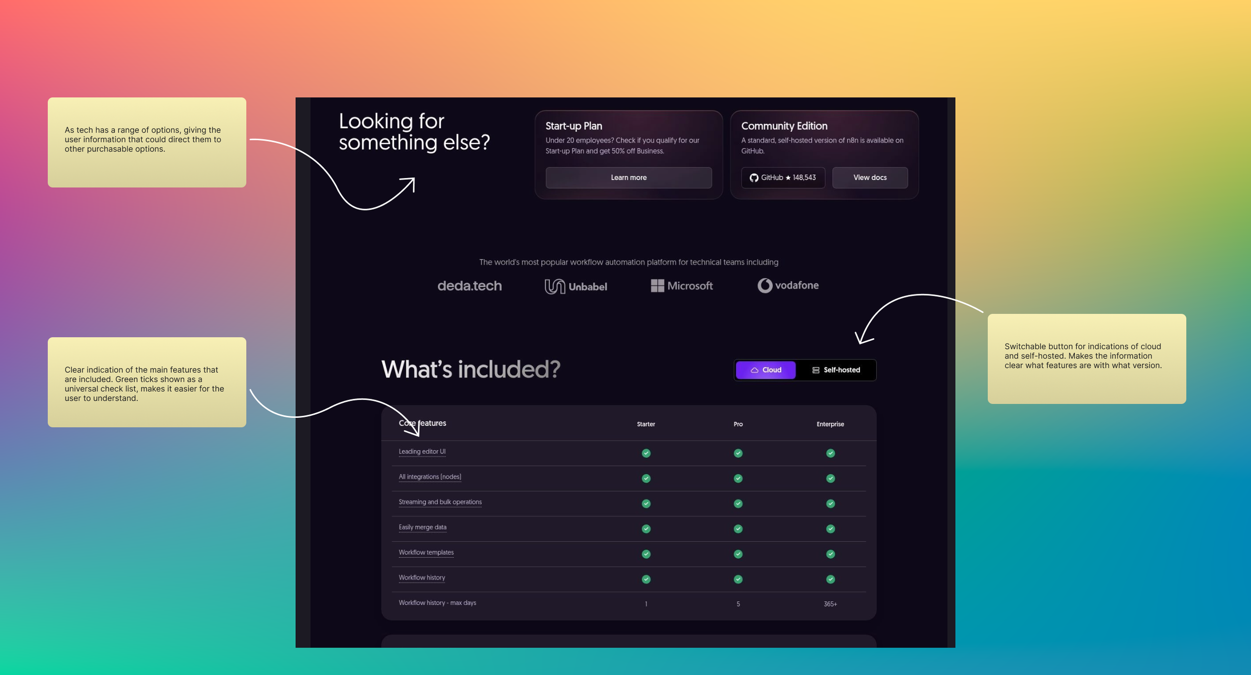
To make a design decision to make an improved design, I needed to look at how some other sites for a service did their pricing views. This led me to sites like Railway to see how they do their pricing system for the same area of tech and similar sites that offered a pricing option fore tech.
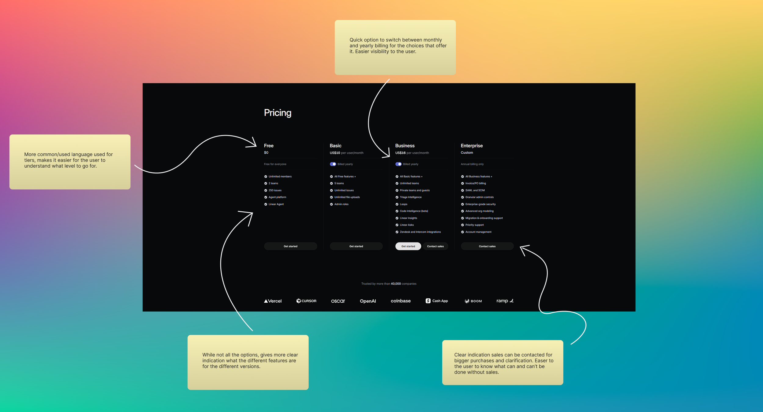
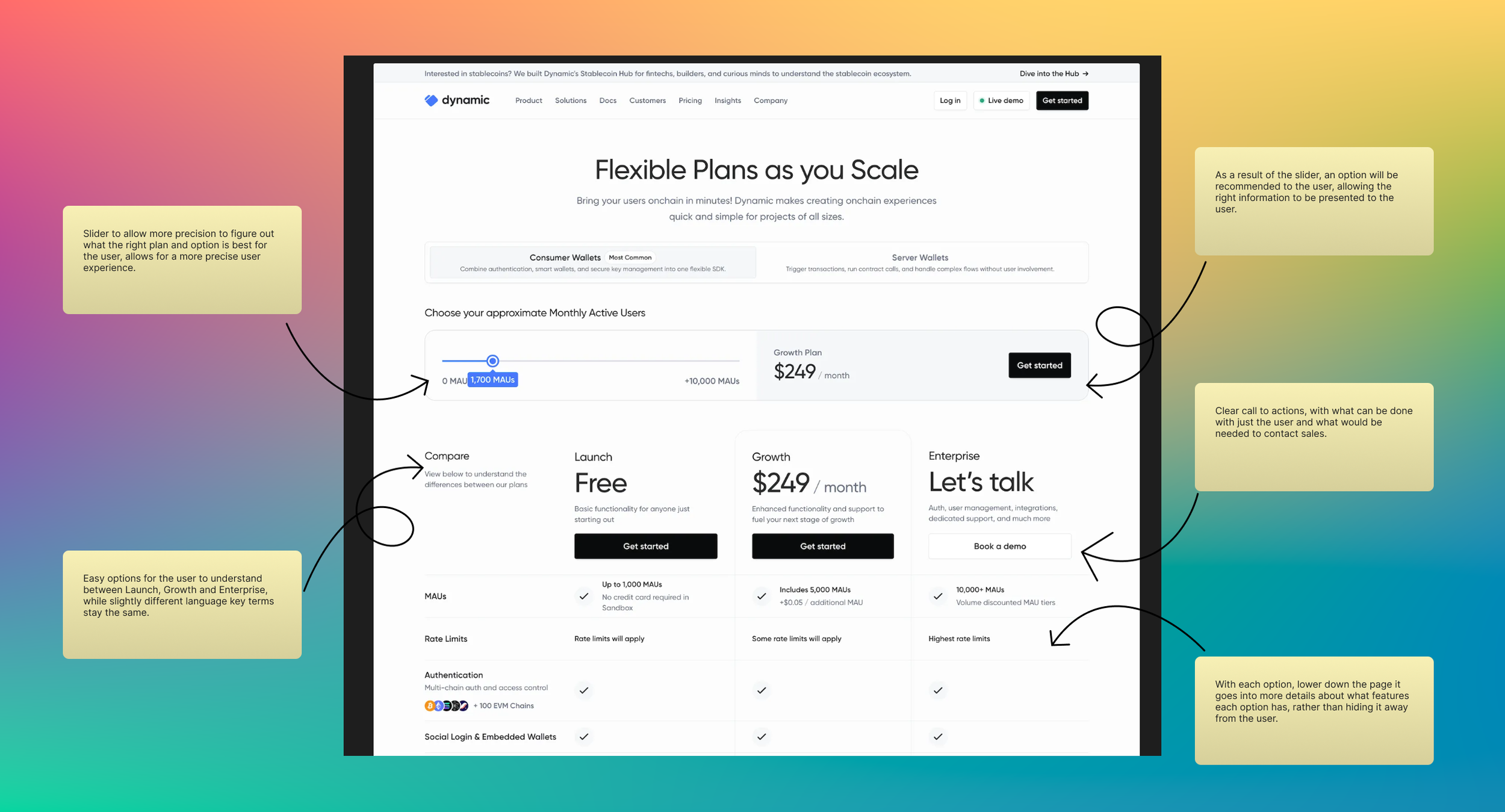
The main takeaways I got from this research and evaluation was the designs for pricing, having clear indicators of what the price would be with it being the larger text size to draw the user in. Most designs have the card like design showcase the options the user has, I personally like this way as it allows the user to quickly view the different options the user has. There is a clear indicator of what each option provides, showcasing the check box design to indicate the user what the option has. In addition, having the user being able to switch between monthly and annually makes payment decisions more malleable to consider. For the second image, having a slider to work out what plan would be right for the user fits in with thinking of the changing ways of a user’s payment decision and would make it more likely for the trust to be put in place between the user and the business. While a lot of these have similar designs the main common layout makes it quick for the user to understand just what they are buying.
Below are my notes on different payment designs that I looked into.
The New Design
Wireframe Concepts
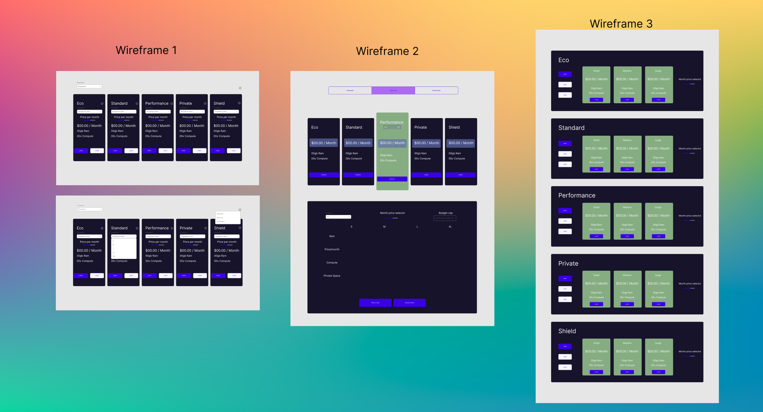
To start the design process I created three different wireframes of different concepts for the change in how the tiers are presented to the user. As well as crafting a cart experience that would have safeguards and clear information.
Having inspiration from the research and evaluations I did, I took the direction of having the information of each option right to the user rather than a drop down as having information that is easy for the user and draws their attention in is what is important in this area.
Wireframe 1
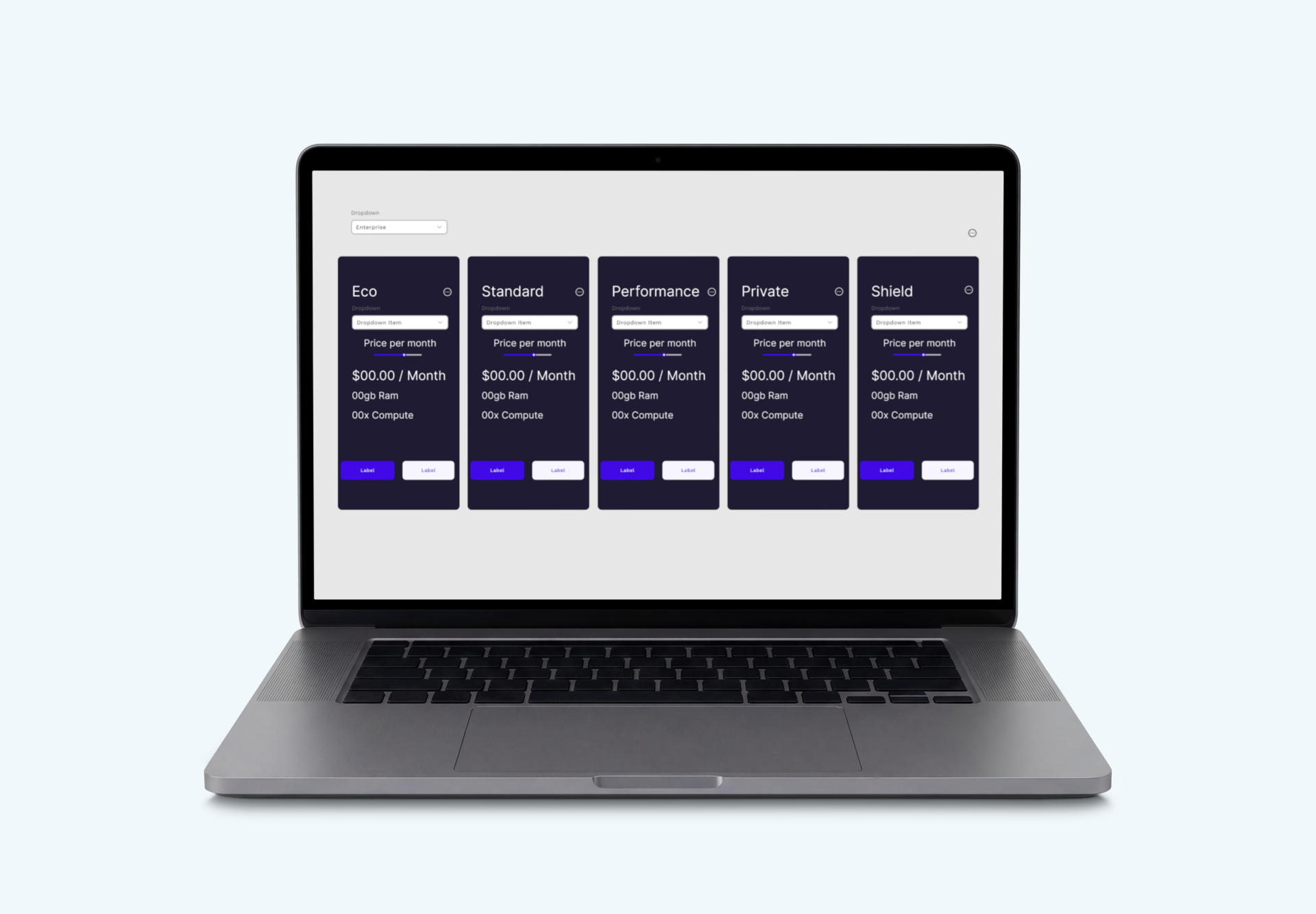
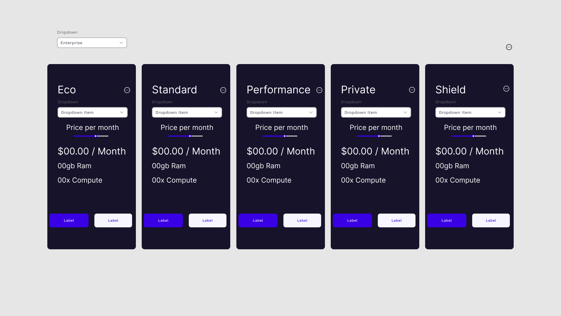
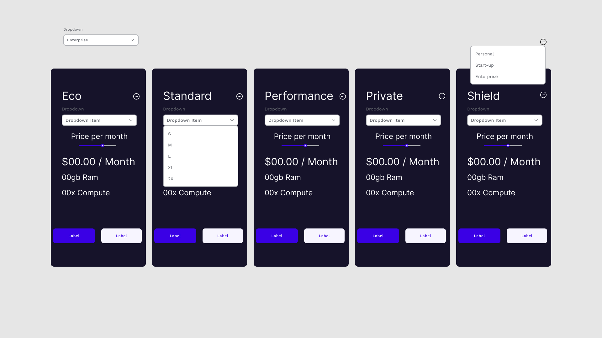
In this design is a all compact card system that has all the user choices in one location. With the size selection and the price slider, it allows the user to chose their size and calculate what the price would be per month for the user. This design does rely a lot on dropdowns, not as much as the current design but still has some lingering effect in this design which does question if I push forward with it. With it being in a compact version it allows the user to decide on what is the best option for them while being able to very quickly compare to the other options.
Wireframe 2
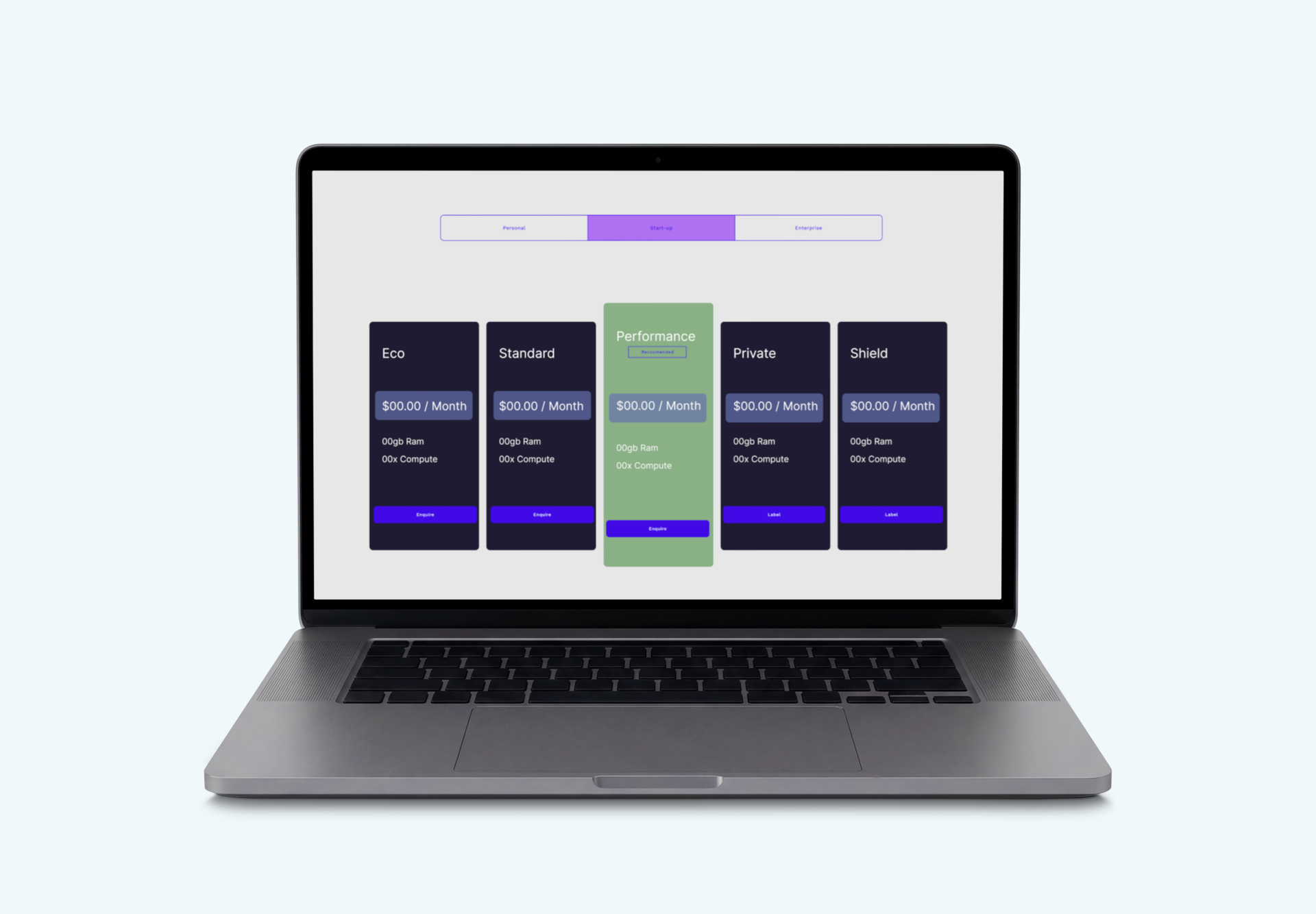
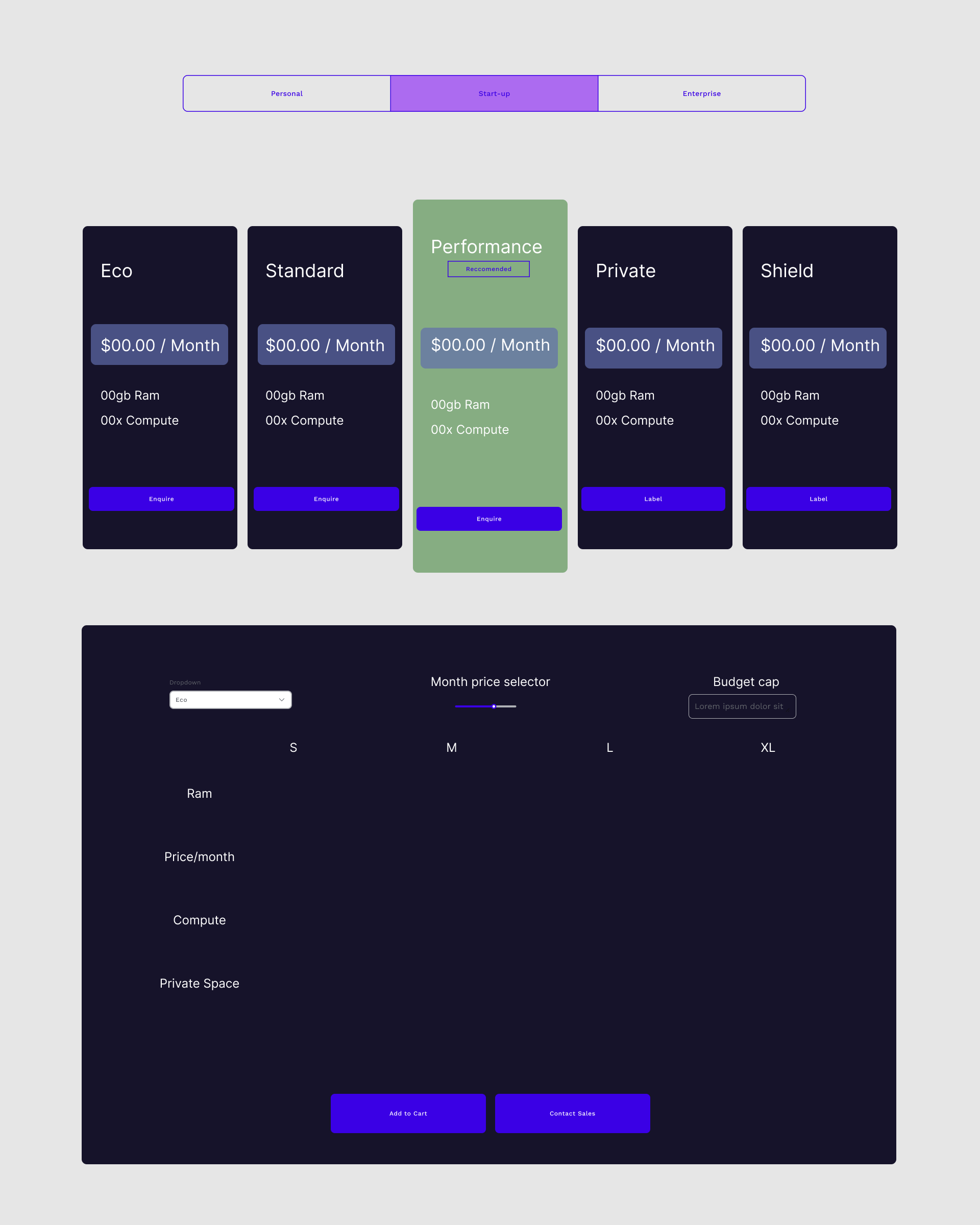
for the second design, which I feel is the stronger one, still having the card like system, but showcasing what the best option would be for the user and then separating the calculator into it’s own unit. With the cards I have made sure to highlight the cost as the main point to draw the users attention as that is the most important information that the user needs and highlighted the recommended version with the text to show case it. For the version calculator I have just put the minimal options there which can be added later but having it’s own unit to then see how it compares to the different sizes and what is truly on offer will help the user to understand what they can get and remove an purchase anxieties.
Wireframe 3
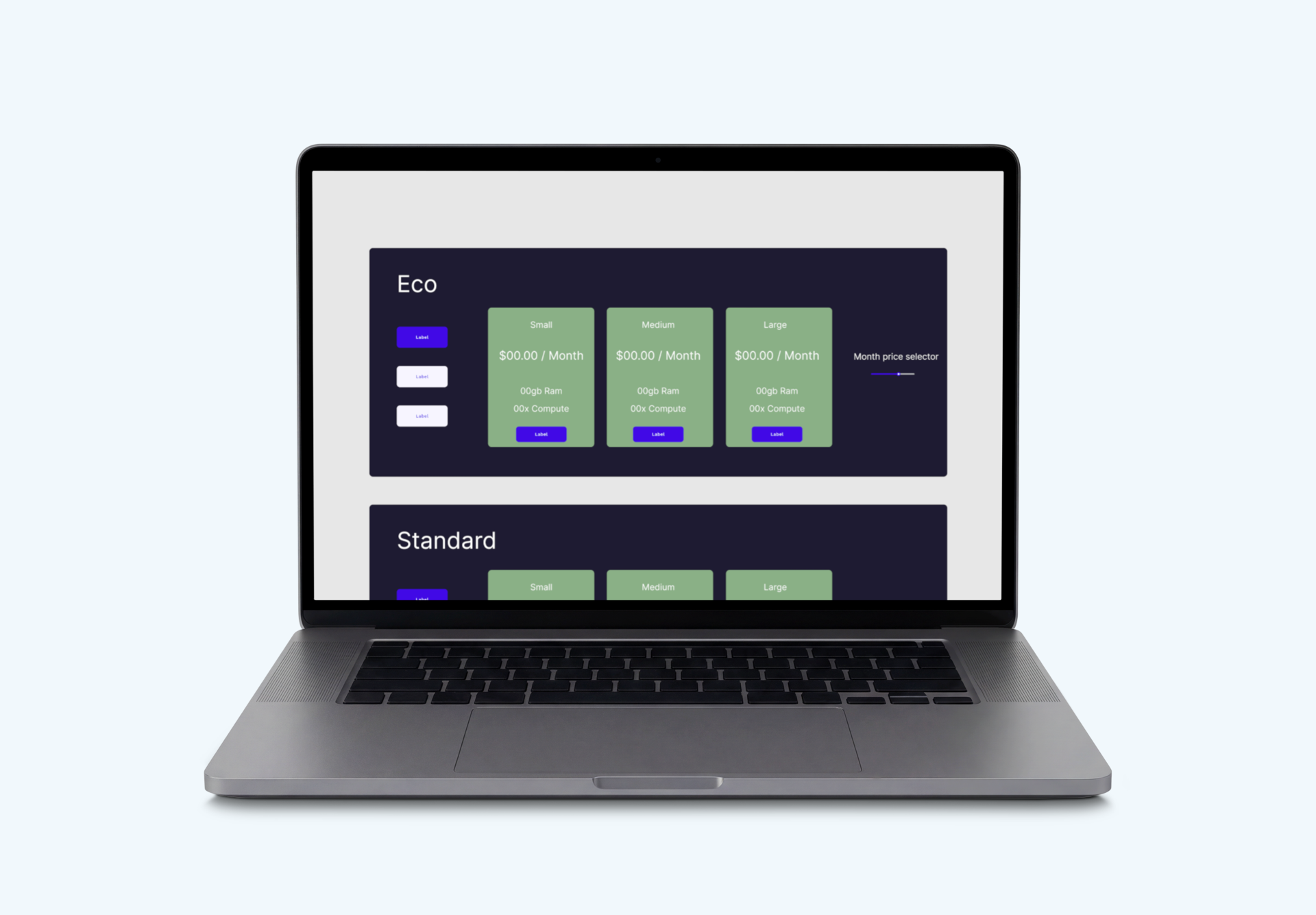
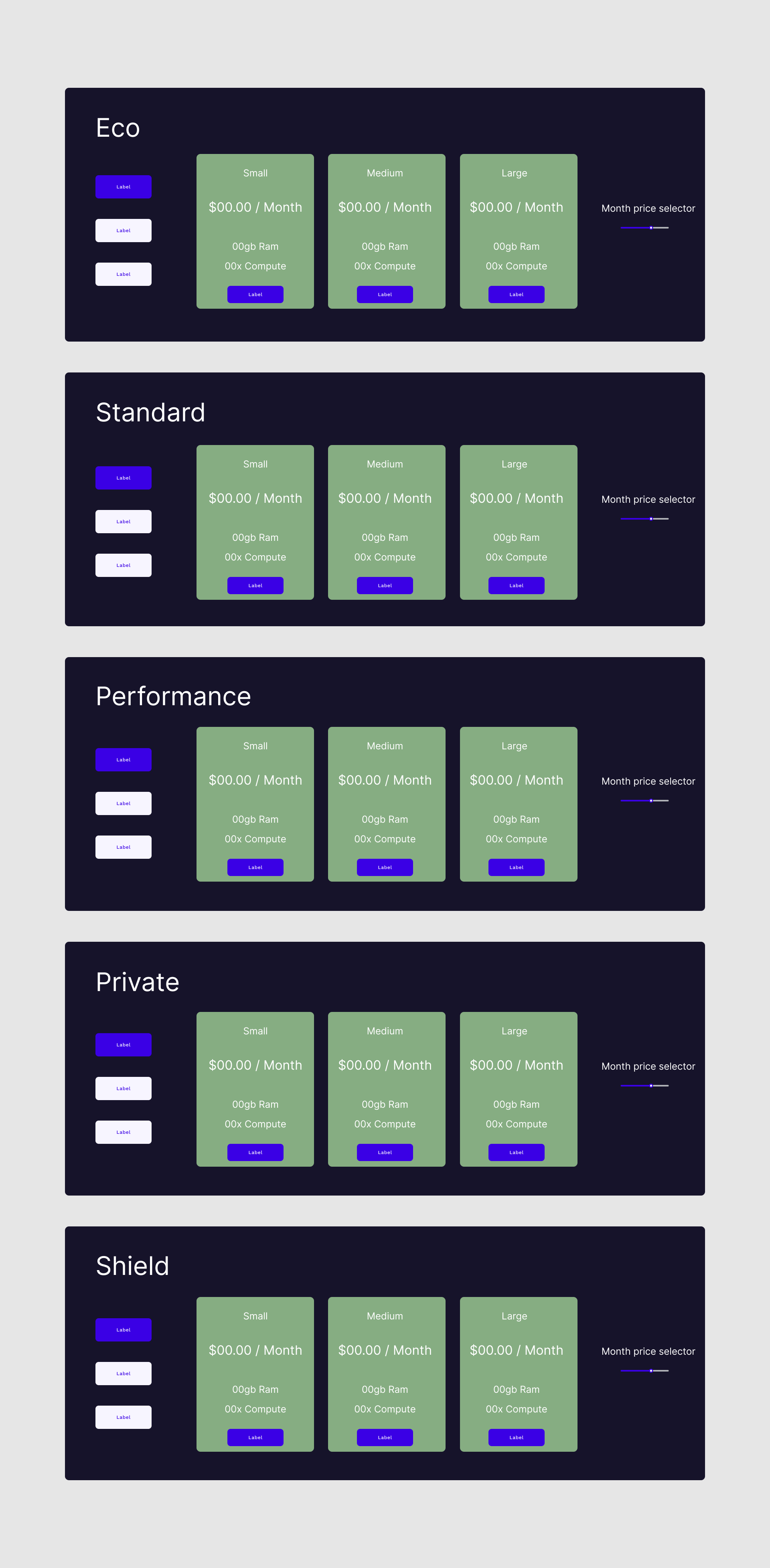
Finally for the last wireframe, I went with a full banner design for each of the different products. This was to collate all the sizes into each product and a way to improve the given information to the user. While I do like the added space it gives it does have an issue of it being hard to compare to other options. There is more I could do with the space but to have the essentials I kept the slider to have accurate information and a switch between the personal and enterprise versions which the design would scale to. The other downside to this design after making it is how it would interact with other products to buy as it is a lot of screen space.
Cart Design
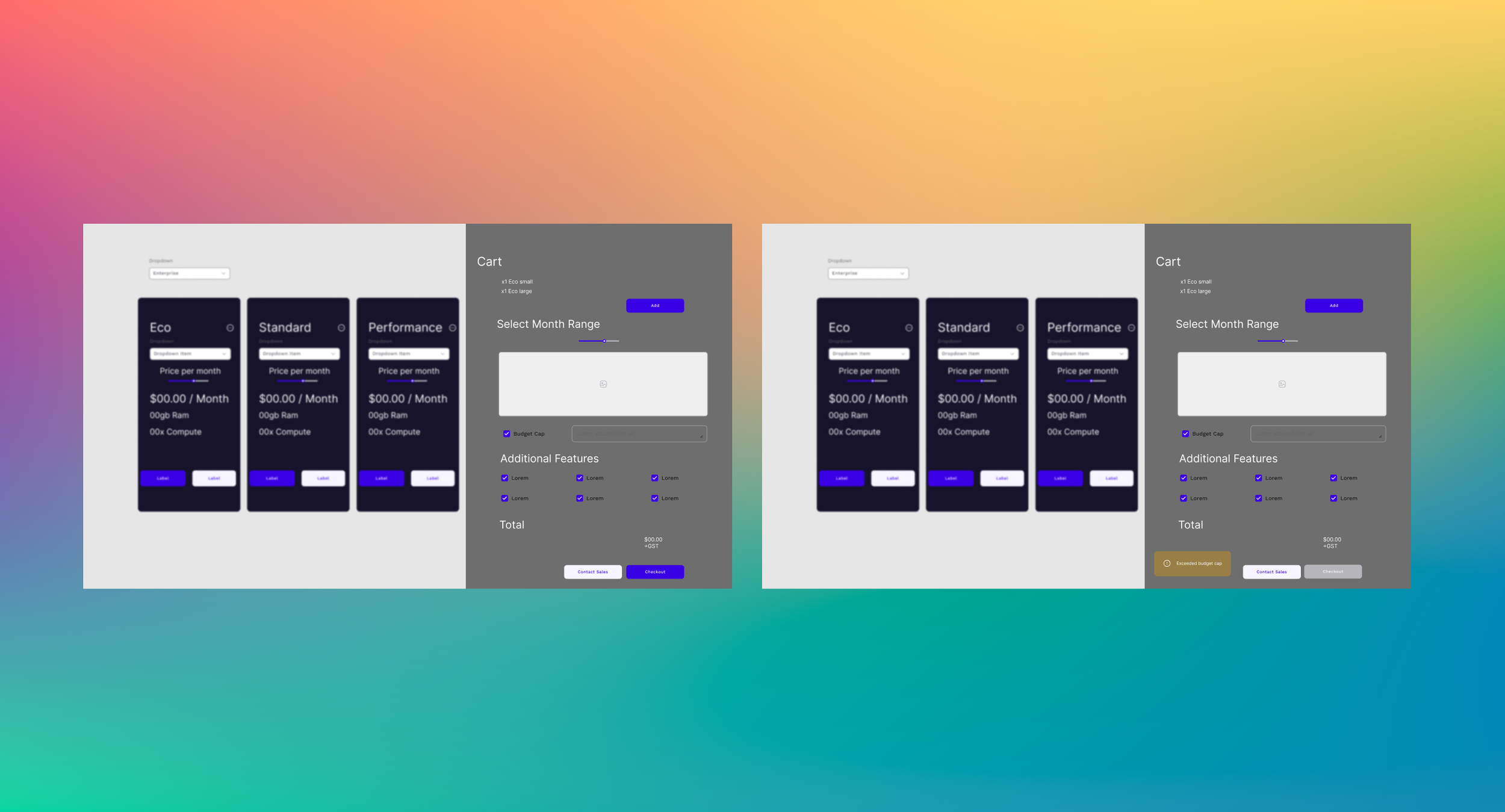
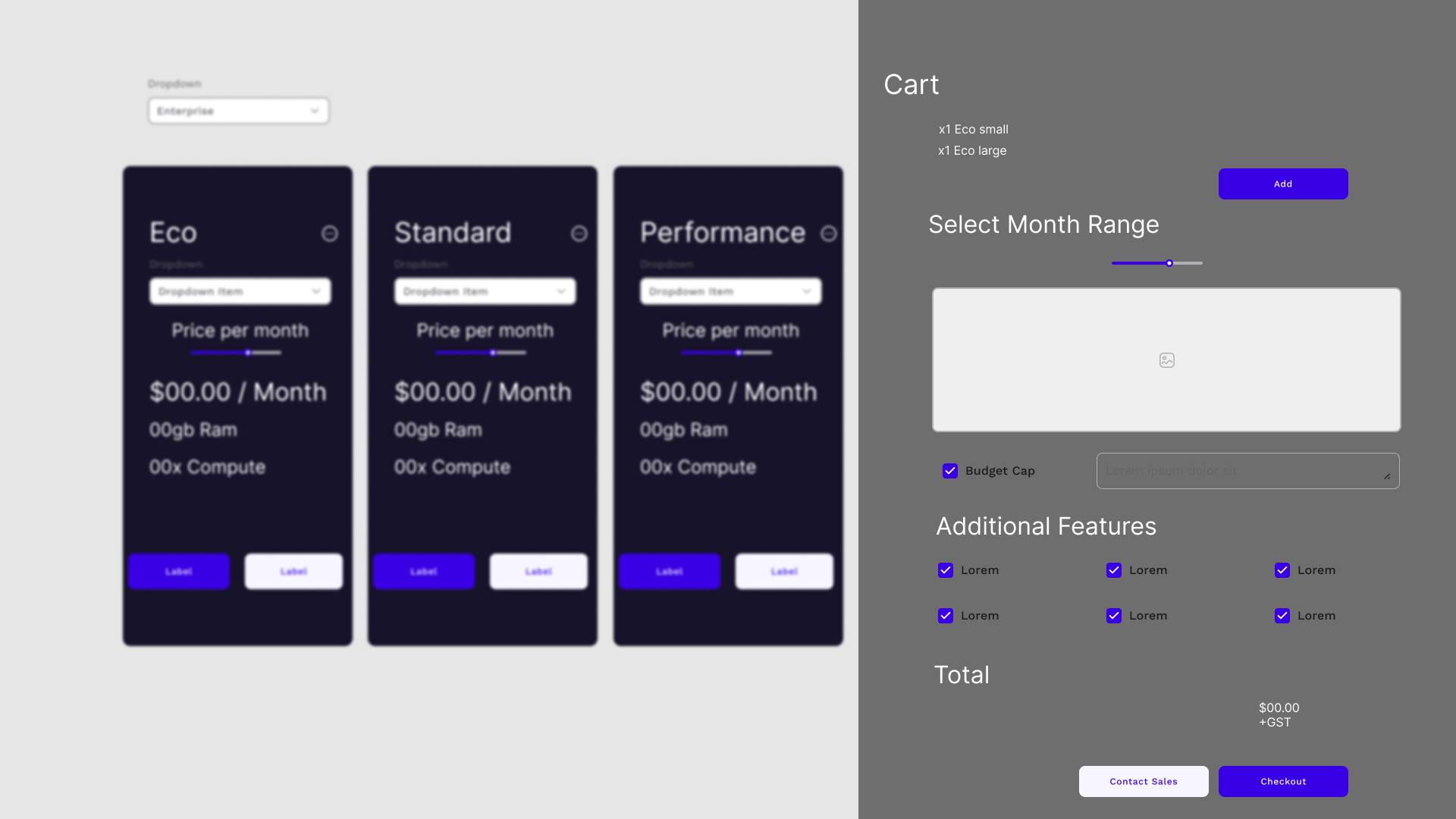
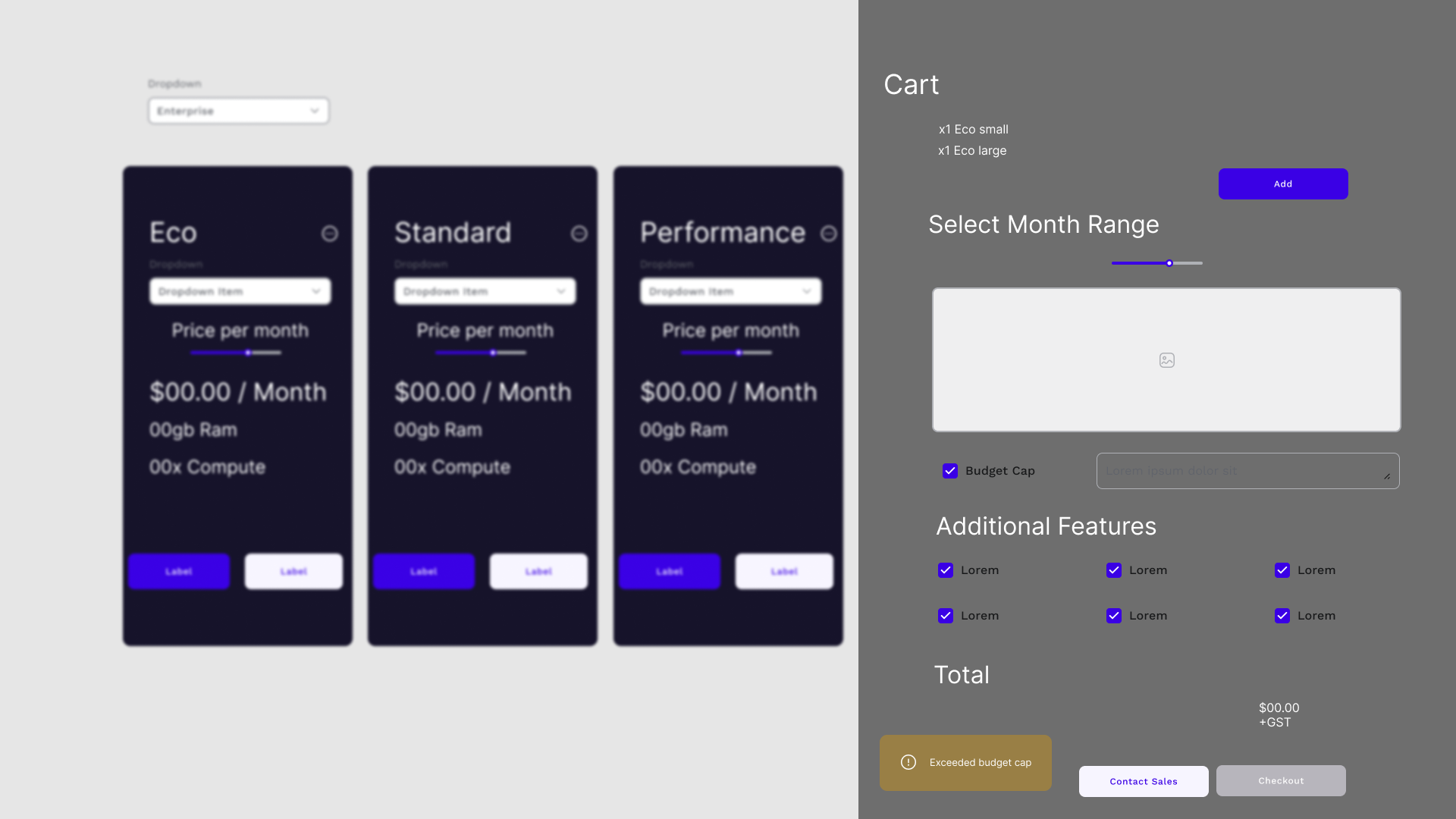
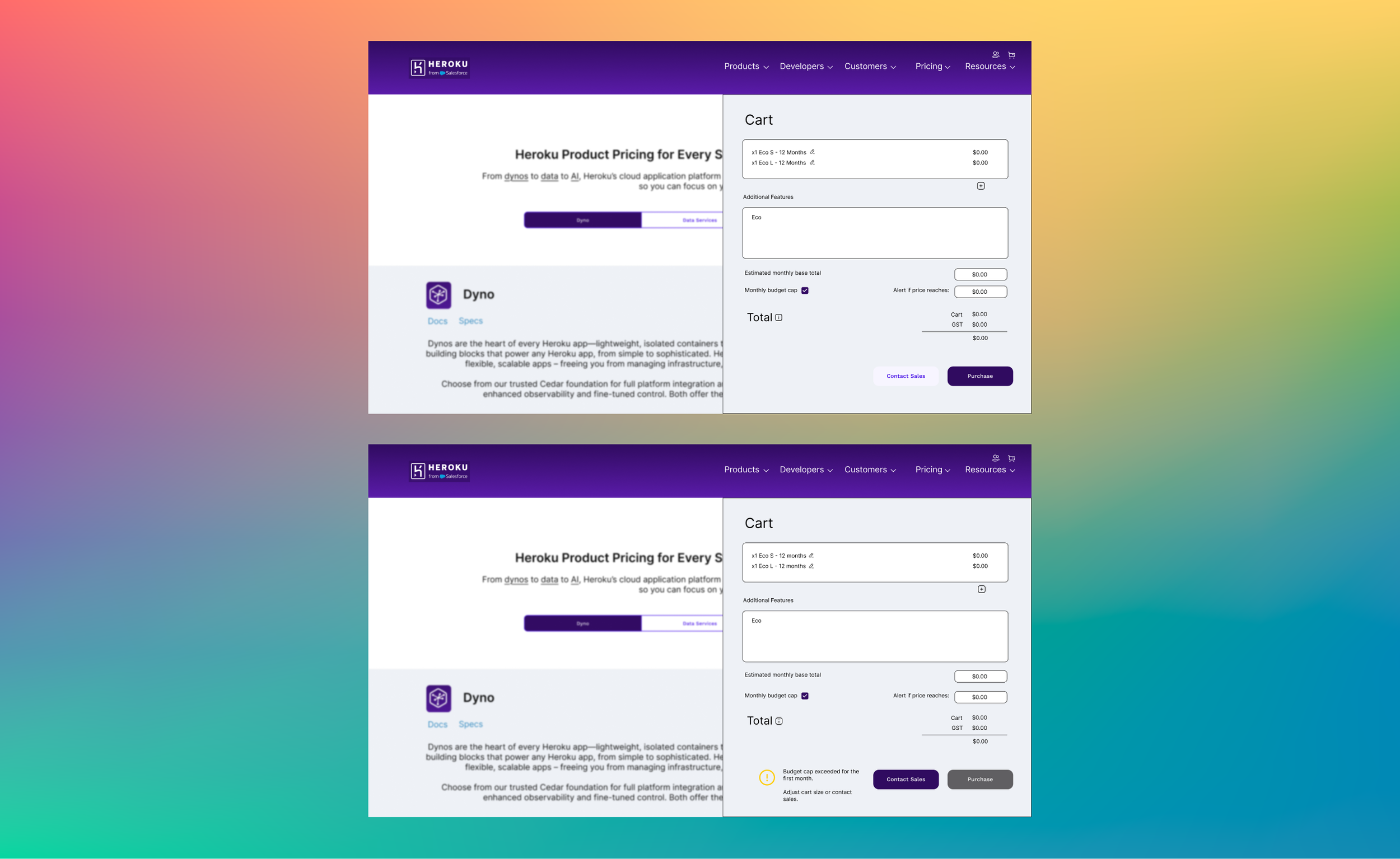
As cart designs are very universal in many online shops, I took the inspiration to have this cart design be a window pop out by hitting the cart icon or when the user has added to their cart. I have made it clear that the user can set out a budget cap, that way to stop any price hikes or any hidden costs that could change. In order to make sure that every feature is known I added an additional features section so it nis clear to the user what is exactly included in the purchase, which would be a good place to clearly put information that could help the less tech users to understand what they are purchasing.
What To Take From The Designs
As part of the design process I need to review my different concepts and push forward with what works and what doesn’t.
In wireframe 1 I tried to combine everything into the panels but I think it makes the tiles too crowded, when that space could be used to highlight different text for the user to lock into more. Though having an option to contact sales on each option for me feels better as it allows the user to get the information on all levels and not just the unique ones.
In wireframe 2, I like this design the best out of the three, with the separate calculator, the highlighted recommendation, the slight design change around the price to highlight it to the user. The potential downside is the bigger screen size due to the separation of the calculator, but I believe this is a necessary step as it allows more information to be put into then calculator, which more items can be added to it after the proper features can be finalized into a more streamlined list.
While I do like the wide design of wireframe 3, there is less ease in comparing it to the other options and in terms of spacing there is more I could put in the larger square. So there would be a lot of scrolling on the user to figure out what the best option is for them, which in my mind shows a potential flow problem compared to the other wireframe concepts.
To move onto the next step I decided to mainly take the majority of the design decisions from wireframe 2 as having the easy to read design and being able to switch the recommendation between what the user needs under the umbrellas of Personal, Start-up and Enterprise, however I would take that option from wireframe 1 as it fits a bit more into the branded design of the website. I think separating the calculator into its own unit makes it its own thing which the user can be guided to as a check to prevent any anxiety the user might have.
Final Design
For the final design I took what I had from the wireframe concepts and shifted it to make sure it still fitted with the brand guide of Heroku’s website. Using the white and off blue colours to shift the attention to the main price decision the user will make. I will go into more details about my decisions below.
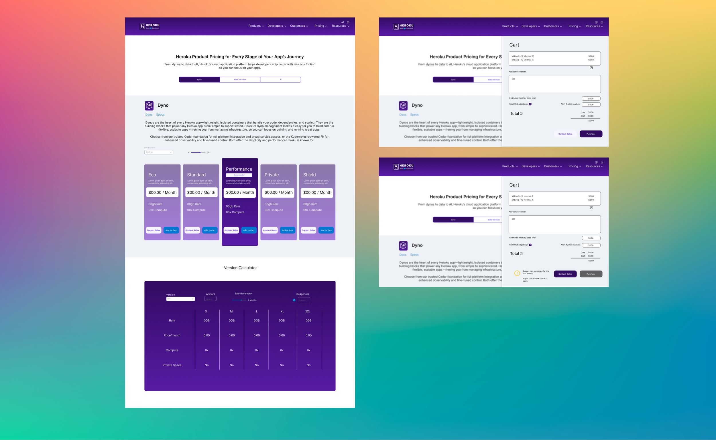
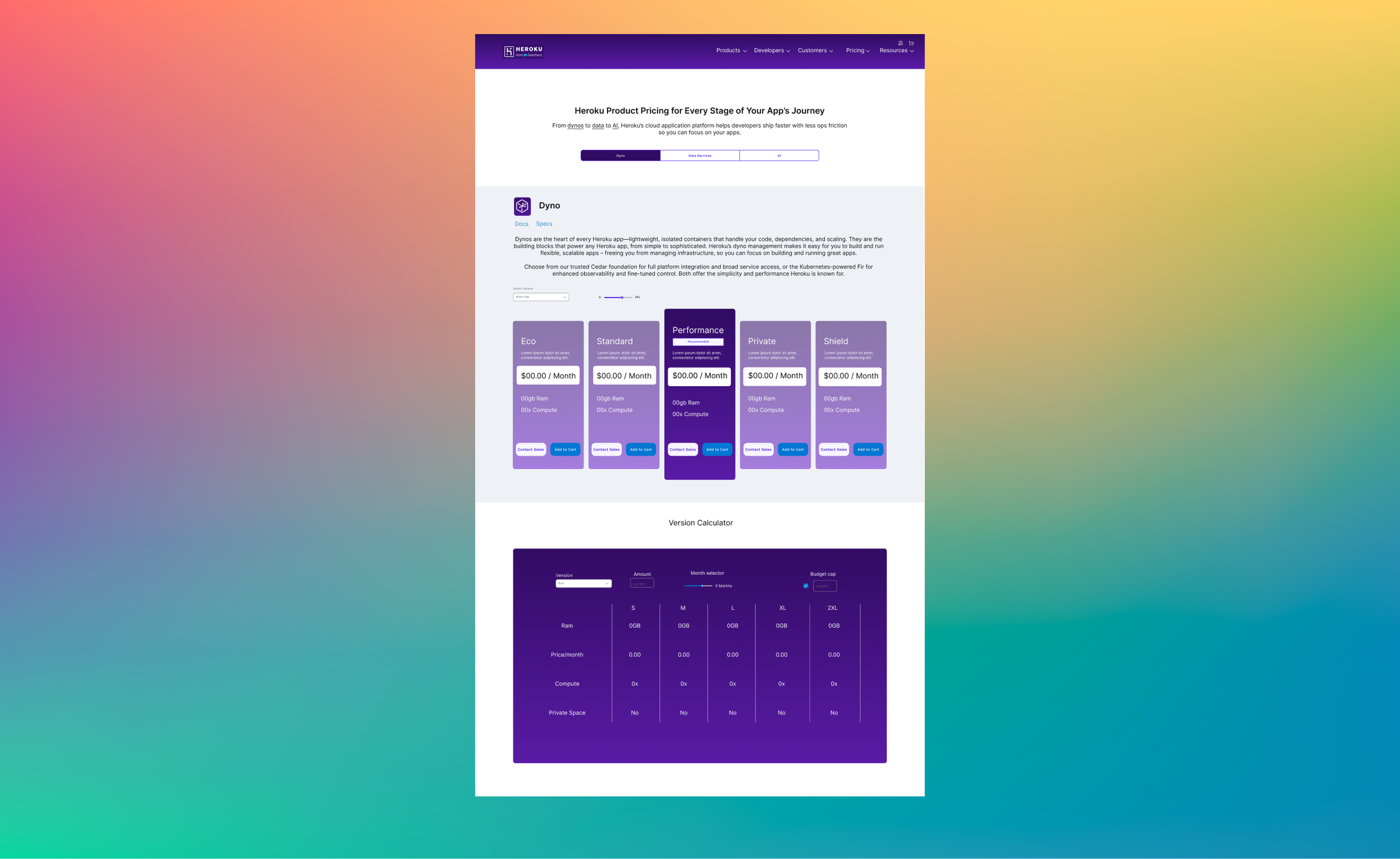
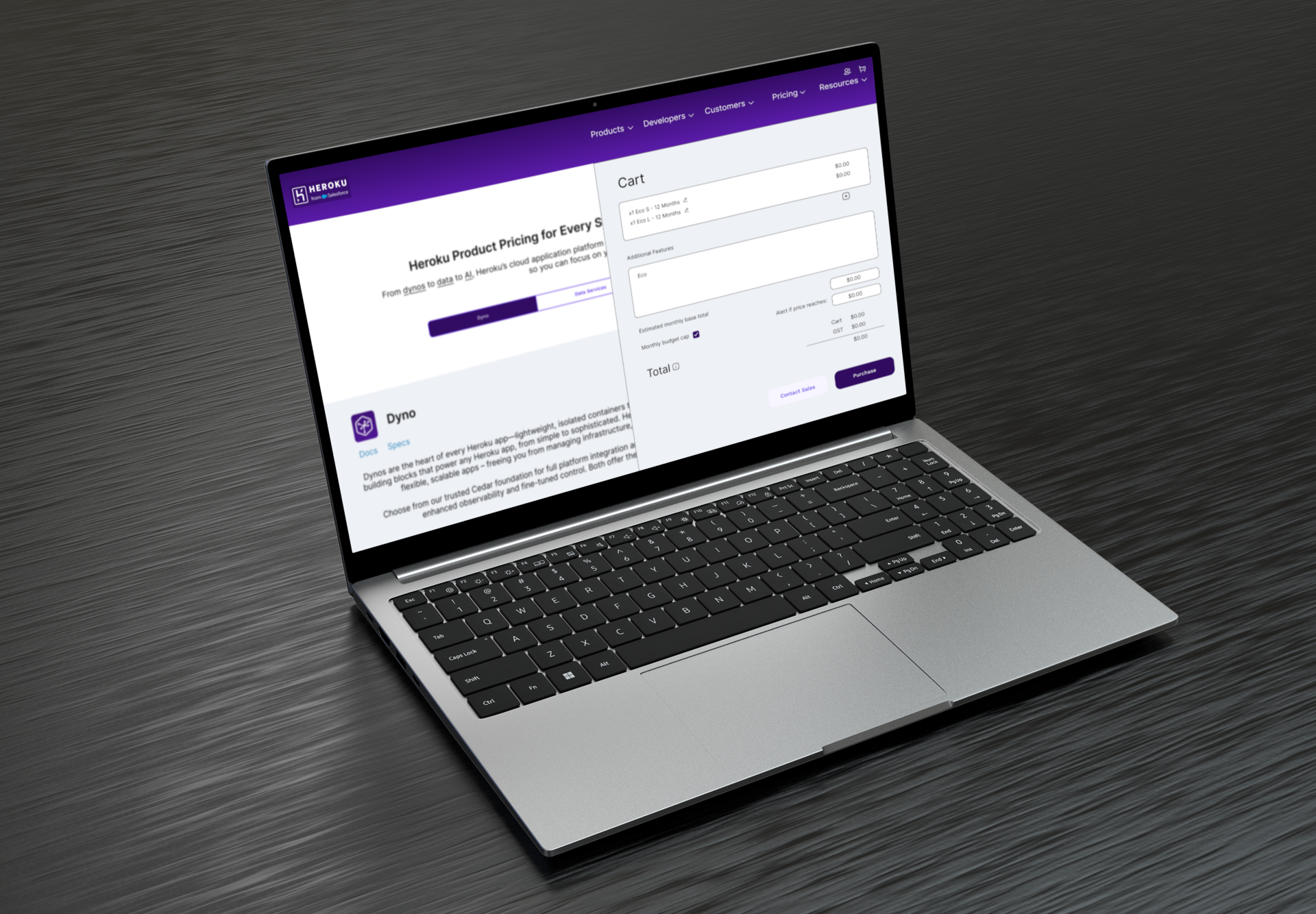
Below are the high fidelity mock ups of three screens, the main page, the cart and a cart alert for budget limits.
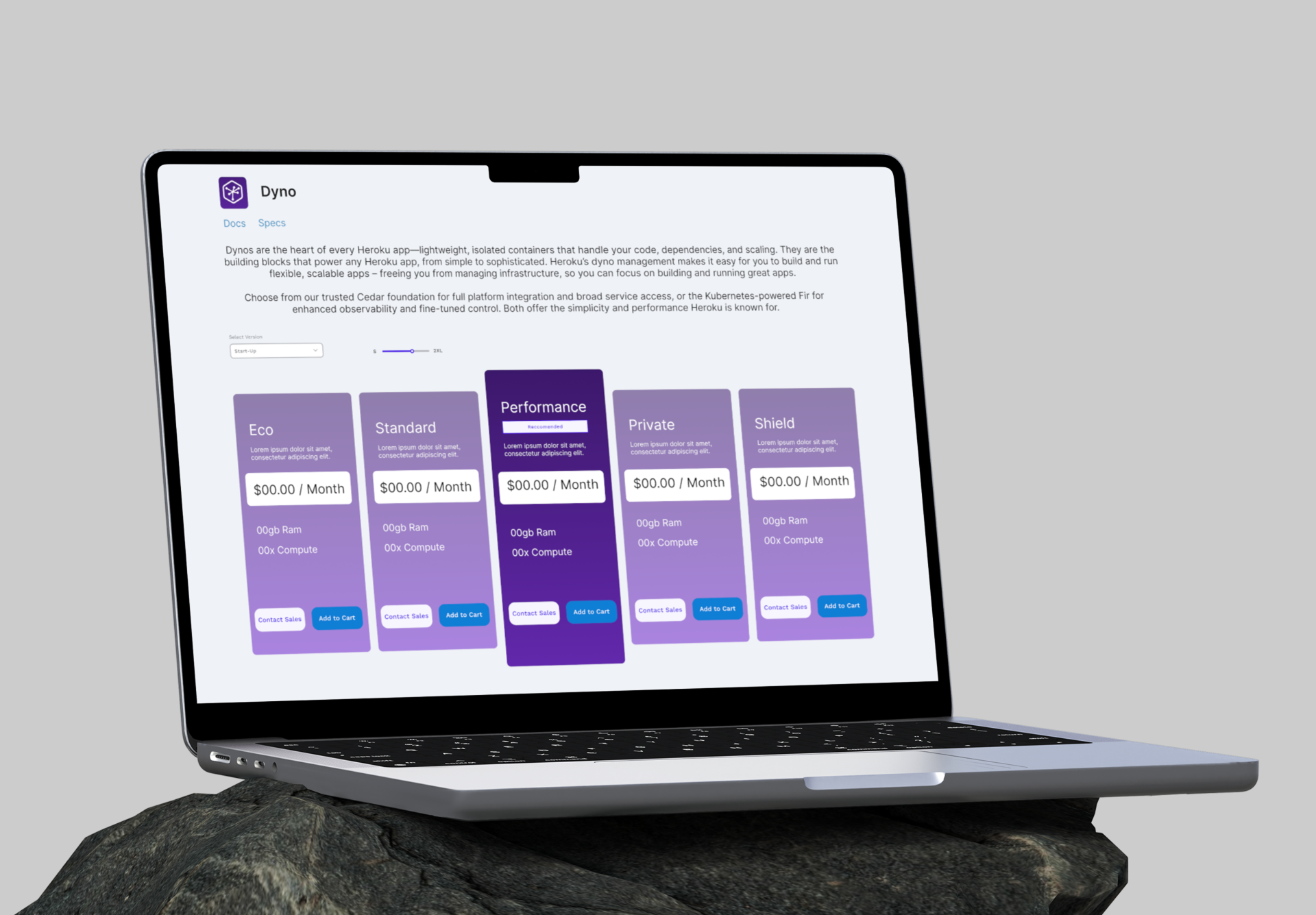
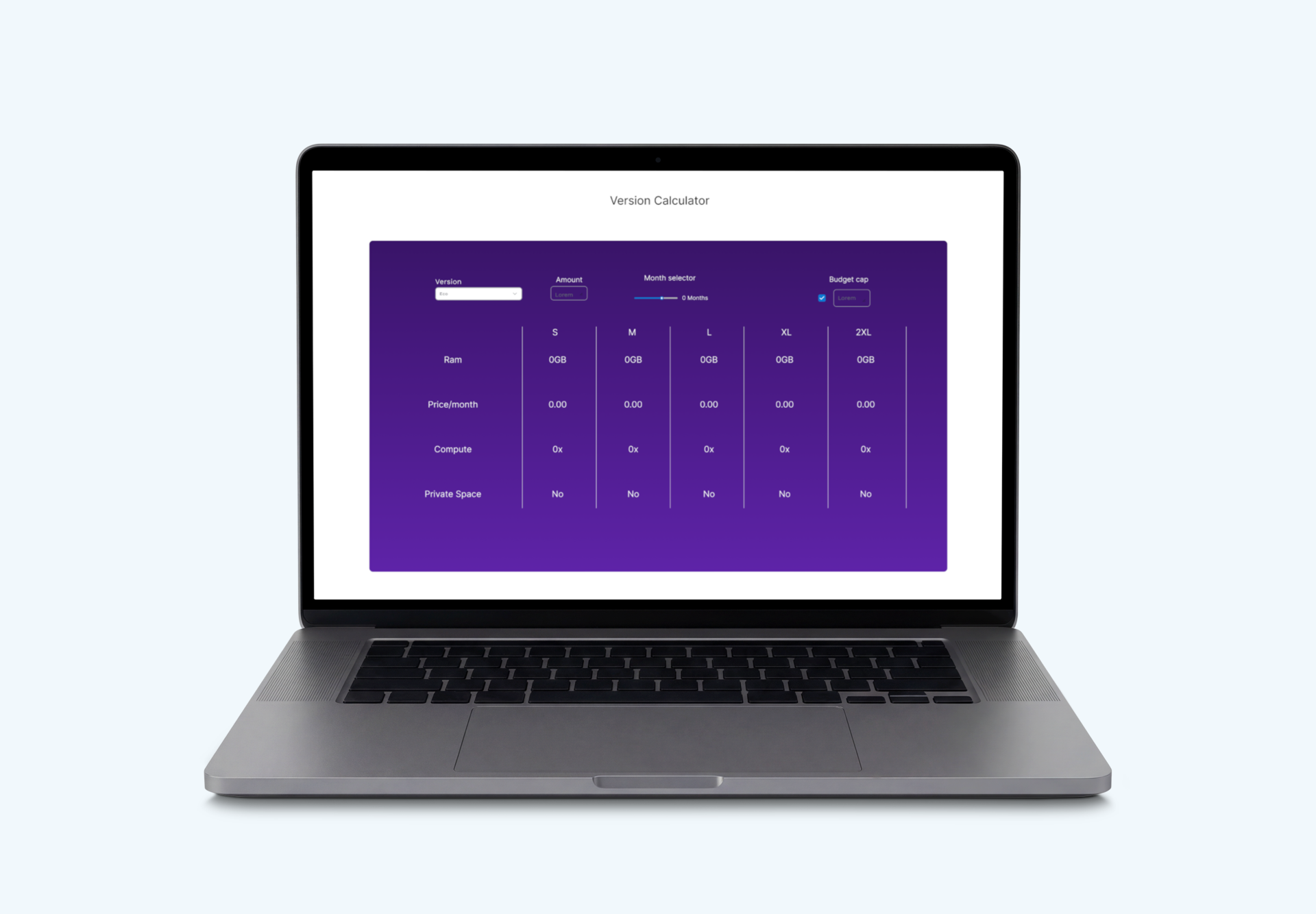
Main Page
The main design that I went with plays parts of the other concepts I made but pushing for the branded colours of Heroku. Starting from the top I copied the same text intro to make it clear that this was still in the price page, as for the change I made in this section I went with the tabbed section so when clicking on the dynos tab as it is now it will change the page to the relevant, making it easier on the user to really get to grips of what they are after, and even though it’s not in my design, there is a opportunity to add more details to each type, making the information easier and accessible to the user.
For the main price section I decided on a mix of my concepts of 1 and 2 with the tab style presentation, now more in a brand colour, with the highlighted recommendation being the more prominent version out of the five. To notes some of the changes, I’ve allowed space for text to be put in place on each tab to fully give the user the right information on what option would be best suited for them, made sure every option has a contact sales secondary button to fast track the flow when contacting services and I’ve added a dropdown and a slider so users can have full clarity on the baser prices of options to edit and change the recommendation to best suit the user.
Finally I have the Version calculator, here is a mix of what would be seen in usual comparison tables, with room to grow with different features to compare to. The main change to this section was to add the brand colours to keep it within the site brand, made a slight change to the budget cap and adding an amount section, that way it makes it easier to calculate how much it would cost for having multiple purchases and hopefully lessens the anxiety of fully planning what the user purchases.
Overall I think this cleaner design helps the user with readability and if I had all the information present of the additional features and benefits would pad out the version calculator more and potentially adding extra details in the main choices section.
Cart Page
For the cart I did not make as many changes from my original concept as the cart design tends to be similar across many industries. I altered my design to the branded colours and changed the additional features into more of an entry point to be a list rather than a check list as I believe it would flow better and have a better range for a longer list of features. The slider has been moved out as I believe that it makes it more sense to make the decision before making it to the cart. Additional steps are in place to make it crystal clear on the anxieties of purchasing with an estimate of what the monthly cost would be and a field to enter a budget warning should the user’s project go over.
While it is a simple design I believe these changes are made with the thought of the user to hold off any extra anxieties in the purchase process.
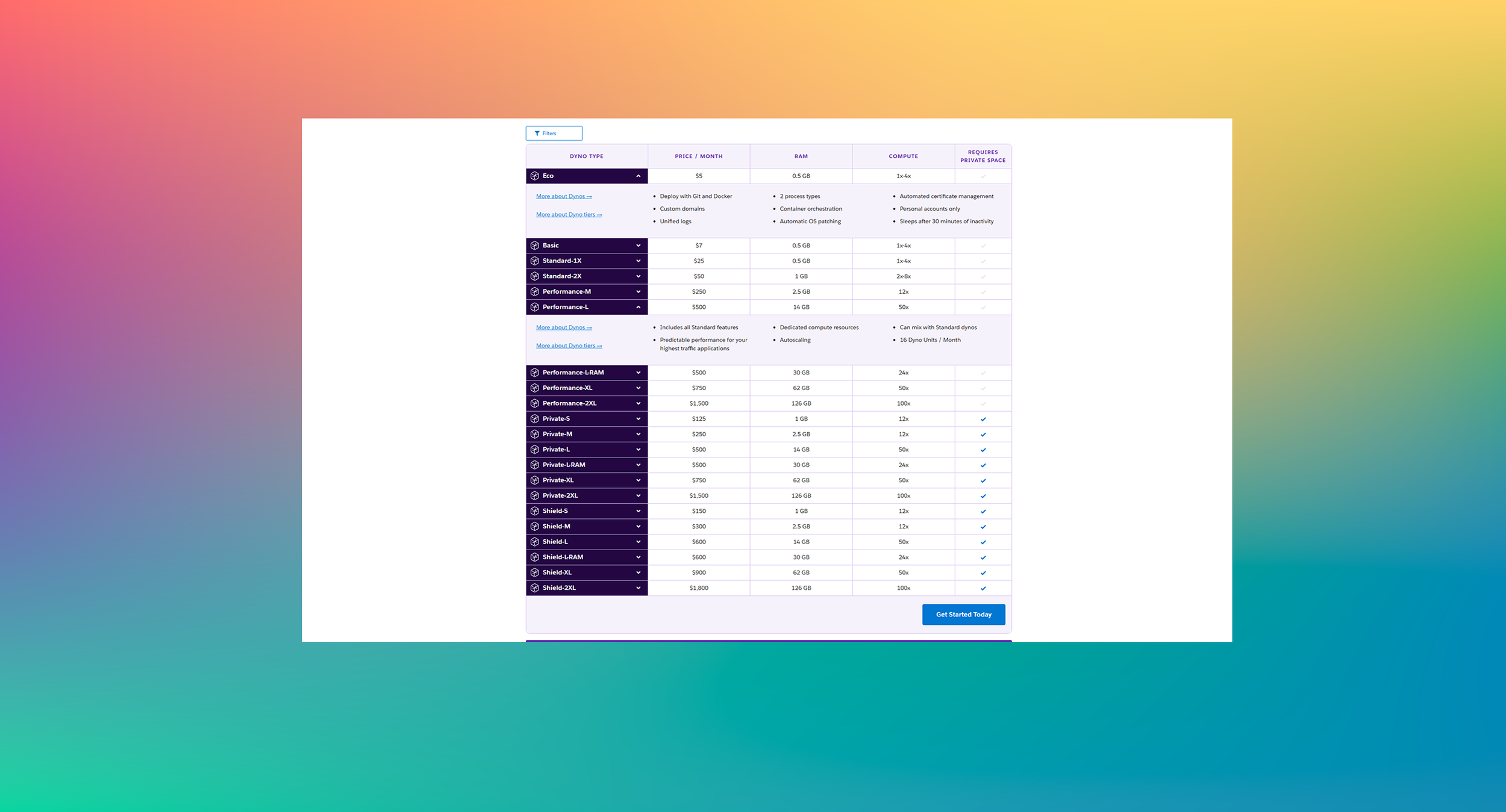
Before
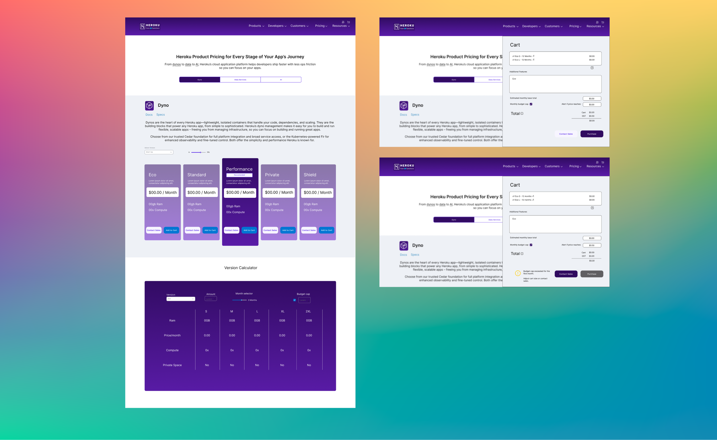
After
Reflection
This project gave me more insight in how important it is to select what information is available to the user and to have fewer walls for them. While it is important to cater to the target audience, I do think there is also need to have some fallbacks to cater to new individuals who might not have the same knowledge. In terms of design it gave me some specific design thinking in order to keep to the brand guides and how to keep concepts into the proper flow of the brand. This also gave me more experience using Figma, mock ups and website design thinking for a topic I have not had much experience in and the background needed to get in the mind of the user.
If I wanted to take this further to the next step, I would move onto proper testing after setting up a prototype version, to see if this new design would offer more to lessen the anxiety of users compared to the current site. As well as testing to see if the version calculator would be beneficial to users. All in a way to not only test the traffic of how people use functions but seeing their behaviour tracks with tech and non tech individuals.